Project Overview

Learn Fabric. Every Capability Explained in One Guide.

A self-contained study guide to the whole Fabric ecosystem: 123 topic cards covering every workload, capability and tradeoff an analytics practitioner is likely to meet, each explaining what a thing is, when to use it, what to watch out for, and where Microsoft documents it. Build the mental model first; the interview and the playbook are there for when you are ready to decide. It opens from a single file, with no server, no CDN, and no runtime network call.

Origin story

I built this to teach myself Fabric properly. The product surface is enormous and the official documentation is organized by feature, which is excellent for looking something up and poor for learning what exists and how it fits together. So I wrote the guide I wanted: every capability an analytics practitioner is likely to meet, explained in one consistent shape, with the tradeoffs stated rather than implied. The merger scenario driving the playbook is the real problem I was learning it for.
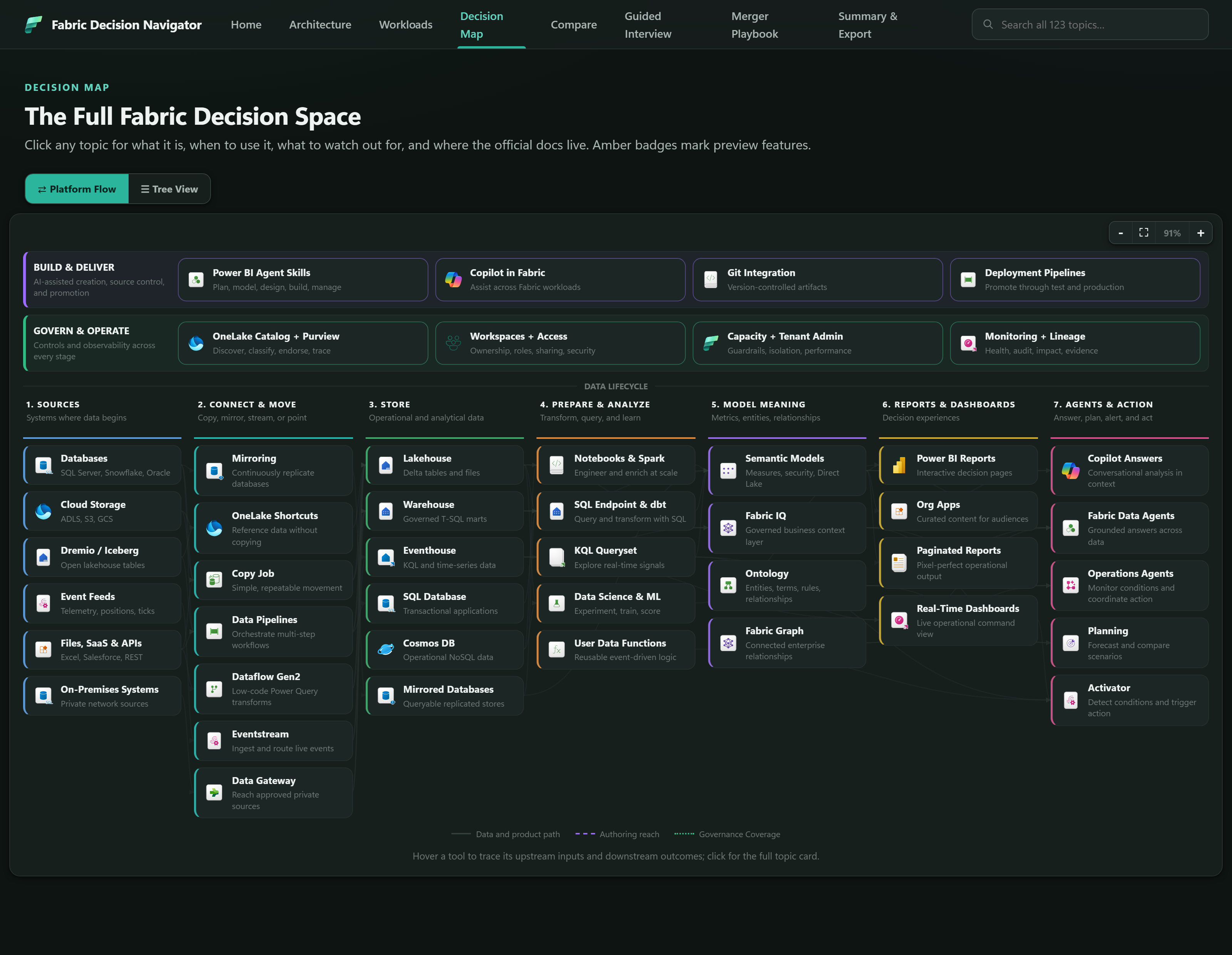
The Fabric Decision Navigator Flow View: a full-width platform diagram with Build and Deliver and Govern and Operate rails across the top, and seven lifecycle columns below - Sources, Connect and Move, Store, Prepare and Analyze, Model Meaning, Reports and Dashboards, and Agents and Action - each holding named Fabric capabilities with official product icons.

The Seven Tabs

Seven views over the same content, in the order the navigator presents them - which is also the order you learn a platform in: what are the building blocks, what does Fabric offer, how does it all fit together, which of these similar things should I pick, and then, once the model is built, what do I decide and how do I record it. Every screenshot is the running application.

Architecture

Containment model 4 levels

The first thing to get right, because every later decision assumes it: what contains what, where compute comes from, and which boundary a given choice actually moves.

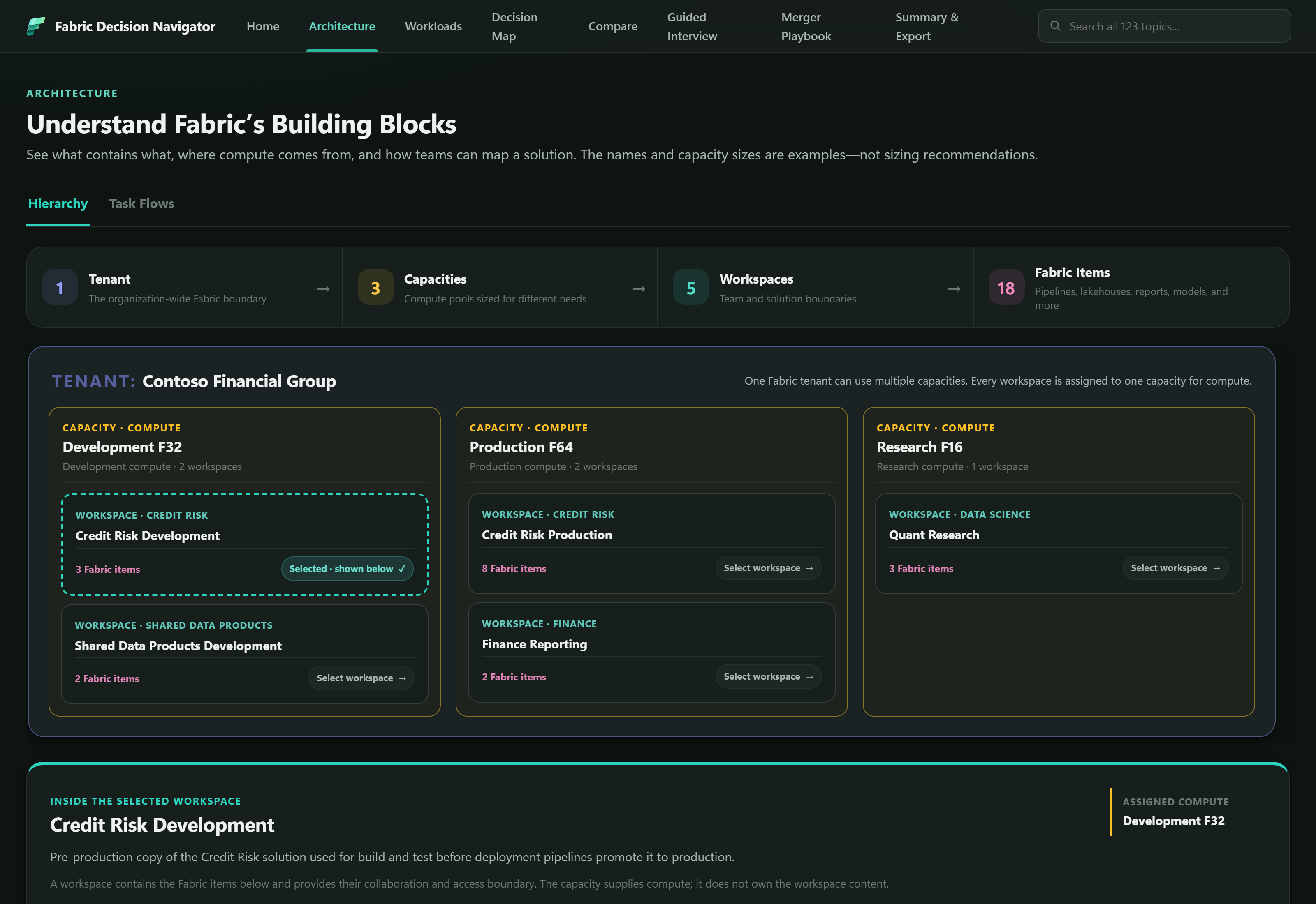
The Architecture tab in Hierarchy view: a containment strip reading 1 Tenant, 3 Capacities, 5 Workspaces and 18 Fabric Items, above an example Contoso Financial Group tenant showing Development F32, Production F64 and Research F16 capacities, each holding named workspaces, with the selected Credit Risk Development workspace expanded below.
Architecture - tenant, capacity, workspace and item, on one worked example tenant

Key Elements

  • Four containment levels 1 · 3 · 5 · 18 Tenant, capacity, workspace, item - shown as a real hierarchy rather than a definition list. The counts belong to one consistent example tenant, so the relationships stay concrete: a capacity carries two workspaces, a workspace carries eight items.
  • Capacity supplies compute, workspace owns content the distinction Stated explicitly in the panel: a workspace contains the Fabric items and provides their collaboration and access boundary; the capacity supplies compute and does not own the workspace content. Conflating those two is the most common early Fabric mistake.
  • Fabric Task Flows 4 patterns A second view covering Daily Risk Reporting, Operational Mirroring, Real-Time Detect and Act, and Governed Machine Learning - each showing which item types a solution actually strings together.
  • Four things that look alike, compared disambiguation Fabric Task Flow, Data Pipeline, Lineage View, and the navigator's own Platform Flow all draw boxes joined by arrows and mean entirely different things. The page separates them rather than leaving the reader to assume.

Examples, Not Sizing Advice

  • The page says so in its own subtitle - F64, F32 and F16 are illustrative, chosen to show that capacities differ by purpose
  • Real sizing belongs to the capacity topic cards, which start from observed demand rather than a suggested number
  • One example tenant runs through the whole page so capacities, workspaces and items stay internally consistent

Workloads

Capability gallery 8 workloads

Microsoft's own workload taxonomy, used to answer a question the Decision Map deliberately does not: what does each Fabric experience actually bring together?

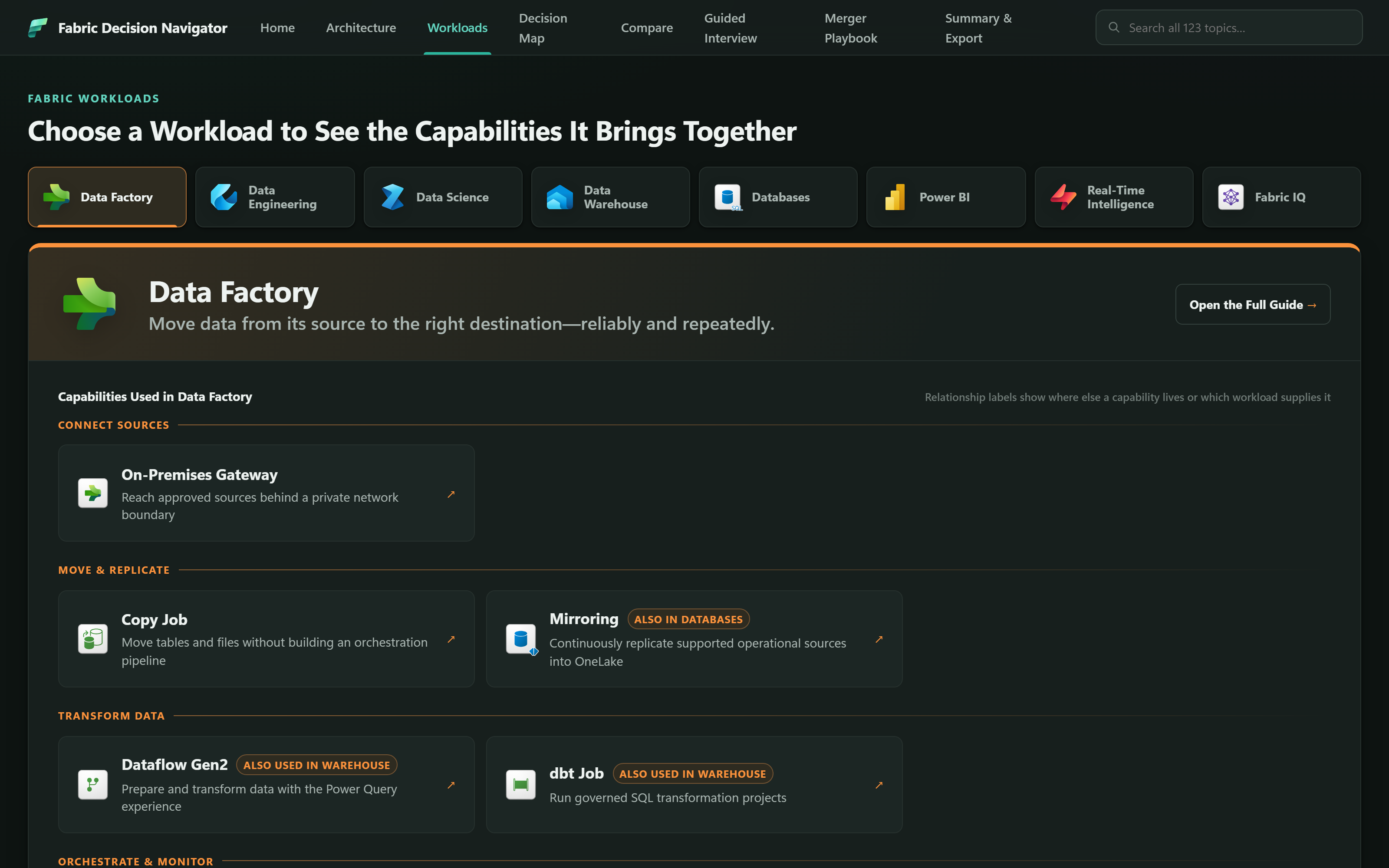
The Workloads tab with eight workload tabs across the top - Data Factory, Data Engineering, Data Science, Data Warehouse, Databases, Power BI, Real-Time Intelligence and Fabric IQ - and the Data Factory panel open below, showing capabilities grouped under Connect Sources, Move and Replicate, and Transform Data, with cross-workload relationship badges.
Workloads - Data Factory, with its capabilities grouped by the job they do

Key Elements

  • Eight workload tabs official icons Data Factory, Data Engineering, Data Science, Data Warehouse, Databases, Power BI, Real-Time Intelligence, and Fabric IQ. Industry Solutions is intentionally excluded as outside a technical decision guide.
  • Job-based capability groups not a flat list Capabilities sit under headings like Connect Sources, Move & Replicate, and Transform Data, so a reader scanning for "how do I get data in" finds a group rather than an alphabetical inventory.
  • Specific cross-workload labels shared badges Mirroring reads Also in Databases; Dataflow Gen2 and dbt Job read Also used in Warehouse. The badge names the other workload instead of a generic "shared" marker, because which one it is changes the ownership conversation.
  • Component-level links into the map deep links Every capability card routes to its full topic card in the Decision Map, so the gallery stays a gallery and the depth lives in one place.

Workloads Are Experiences, Not Boxes

  • Workloads are not storage silos, workspaces, or capacity boundaries
  • Containment is tenant, capacity, workspace, item - a workload is none of these
  • Notebooks serve engineering and science; semantic models are Power BI items that also participate in Fabric IQ
  • Modeling that overlap explicitly avoids duplicating topic records

Decision Map

123 topic cards Two views

The depth of the navigator, organized around twelve architecture decisions rather than around products - reachable as a searchable tree or as a full-width lifecycle flow.

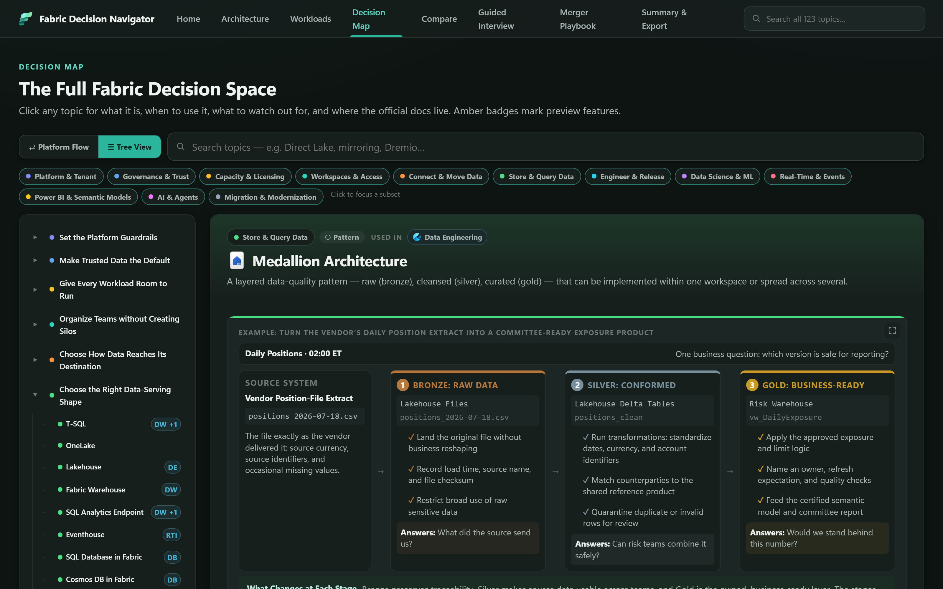
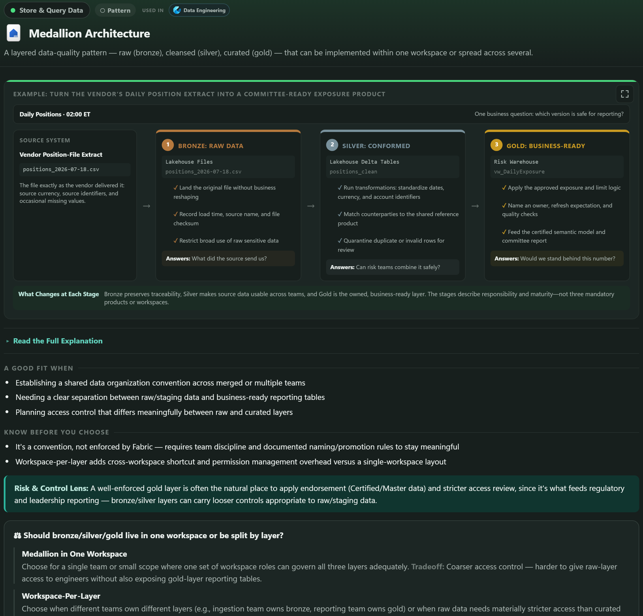
The Decision Map in Tree View: a left sidebar of decision groups such as Set the Platform Guardrails and Choose the Right Data-Serving Shape, twelve category filter chips above, and the Medallion Architecture topic card open on the right showing a four-stage bronze, silver and gold worked example.
Decision Map, Tree View - decision groups on the left, the selected topic card on the right

Key Elements

  • Twelve decision domains filter chips Platform & Tenant, Governance & Trust, Capacity & Licensing, Workspaces & Access, Connect & Move Data, Store & Query Data, Engineer & Release, Data Science & ML, Real-Time & Events, Power BI & Semantic Models, AI & Agents, and Migration & Modernization - each with its own color, distinct from the workload palette.
  • Platform Flow 45 nodes · 94 links Seven lifecycle columns and two cross-cutting rails hold 37 lifecycle nodes plus 8 rail capabilities. Hovering a node traces its upstream inputs and downstream outcomes rather than only its immediate neighbors; authoring and governance edges stay hidden at rest to keep the line noise down.
  • Fits on screen, then zooms own controls The flow fits the complete architecture by default and carries minus, fit and plus controls, so a reader trades overview for detail without resorting to browser zoom and without labels wrapping mid-word.
  • Small workload markers DE · DW · RTI Compact badges show where a capability is used without turning the map into a second workload catalog - the distinction the two taxonomies exist to preserve.

Every Card Carries the Same Shape

  • What it is, when to use it, and what to watch out for
  • A worked visual example using named Fabric artifacts
  • A financial-services note where the control environment matters
  • Links to the primary Microsoft documentation, with a GA or Preview badge

Validated by the Build

  • Zero missing topic-card targets and zero invalid edge endpoints
  • Zero duplicate flow IDs and zero missing product icons
  • Any new flow node must resolve to a real topic card and an embedded icon

Compare

Evidence-backed 7 comparisons

Four worked comparisons plus three reference tables, aimed at the hardest part of learning Fabric: telling apart the capabilities that sound interchangeable but are not.

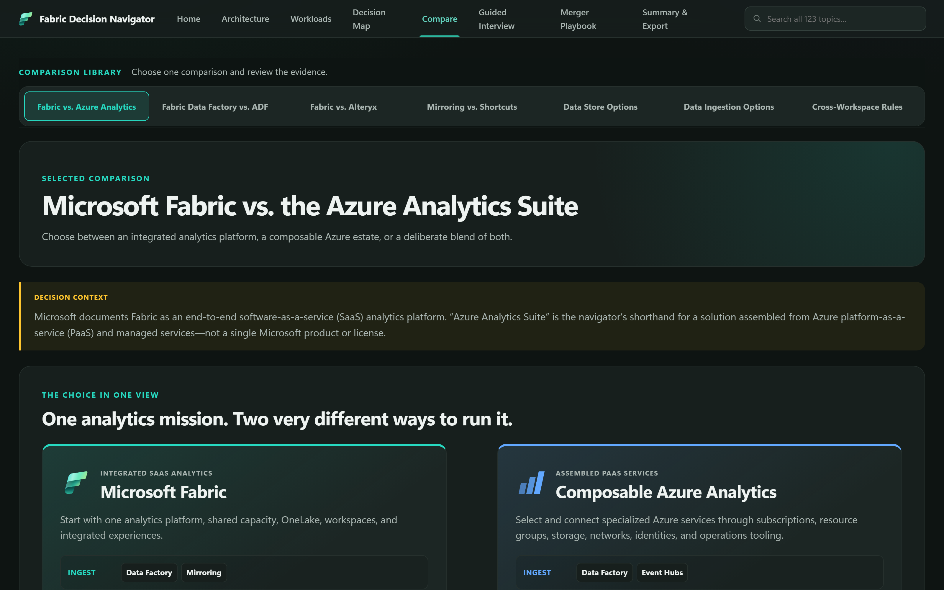
The Compare tab showing seven comparison tabs and the Microsoft Fabric versus the Azure Analytics Suite comparison open, with a decision context callout and two side-by-side option panels labeled Integrated SaaS Analytics and Assembled PaaS Services.
Compare - the platform operating model choice, with its decision context stated first

Key Elements

  • Fabric vs. the Azure Analytics Suite operating model An integrated SaaS platform against a composable PaaS estate. The decision context names the shorthand explicitly - "Azure Analytics Suite" is the navigator's phrase for an assembled solution, not a Microsoft product or license.
  • Fabric Data Factory vs. Azure Data Factory migration Where pipelines translate directly, where they do not, and what the move costs in orchestration behavior.
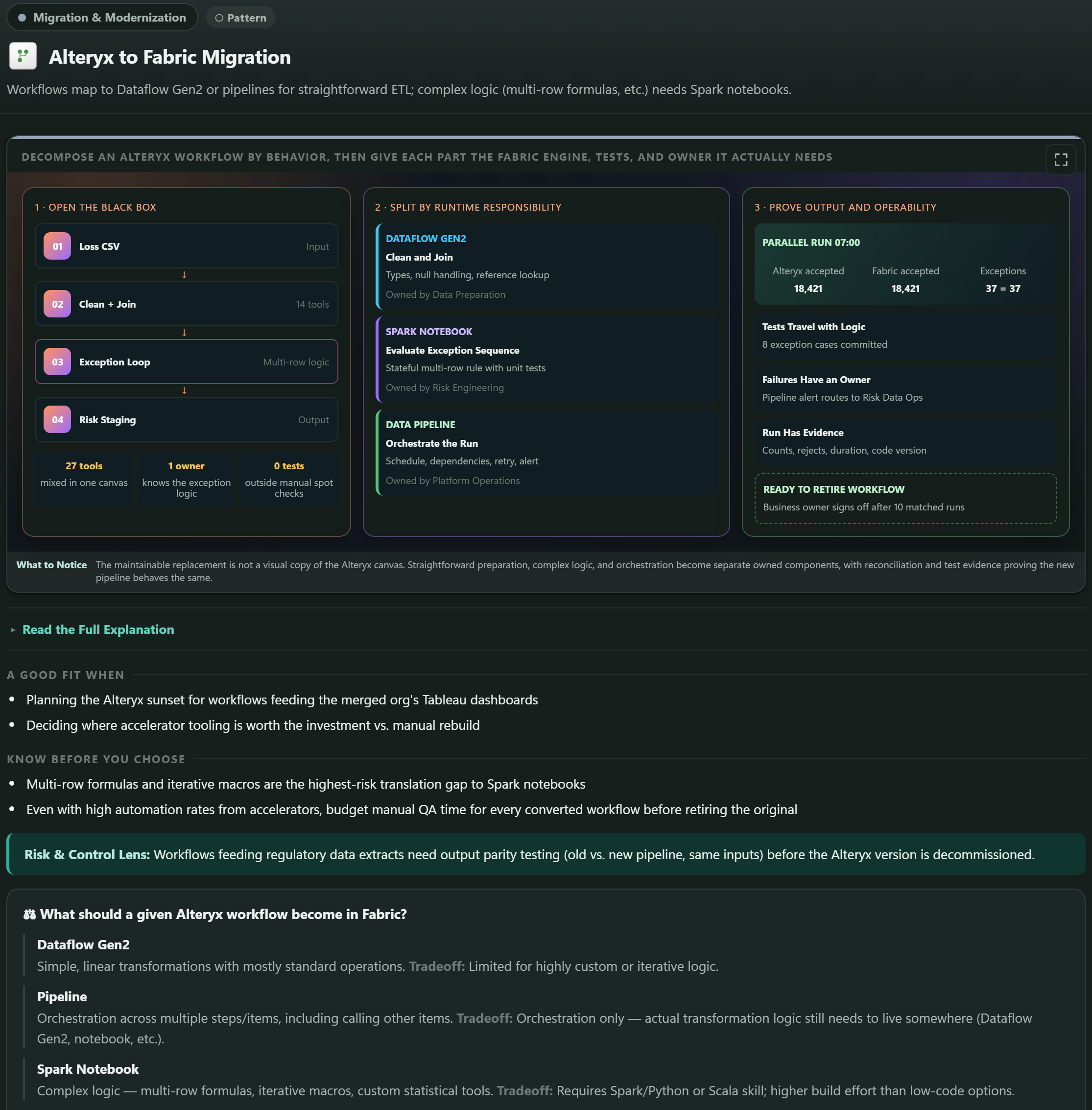
  • Fabric vs. Alteryx modernization Which Alteryx workflow behaviors map onto Dataflow Gen2 and pipelines, and which need Spark notebooks because the logic is genuinely stateful.
  • Mirroring vs. OneLake Shortcuts data access The recurring question for an estate that still owns data elsewhere: replicate it, or reference it in place.
  • Three reference tables data store · ingestion · workspace Data Store Options, Data Ingestion Options, and Cross-Workspace Rules - lookup material rather than argument, kept alongside so a comparison never has to restate them.

Documented Behavior vs. Navigator Judgment

  • Product behavior, licensing and feature status are cited to Microsoft documentation with a review date
  • Recommendations, estimates and migration guidance are labeled as the navigator's own
  • Preview features carry an amber badge, because they change
  • Feature status reflects Microsoft documentation as of July 2026

Guided Interview

Adaptive questioning 23-question bank

Presented as the Fabric Decision Expedition. Its second job is educational: every option carries a plain definition, so working through the questions teaches the vocabulary even when no decision is being made yet.

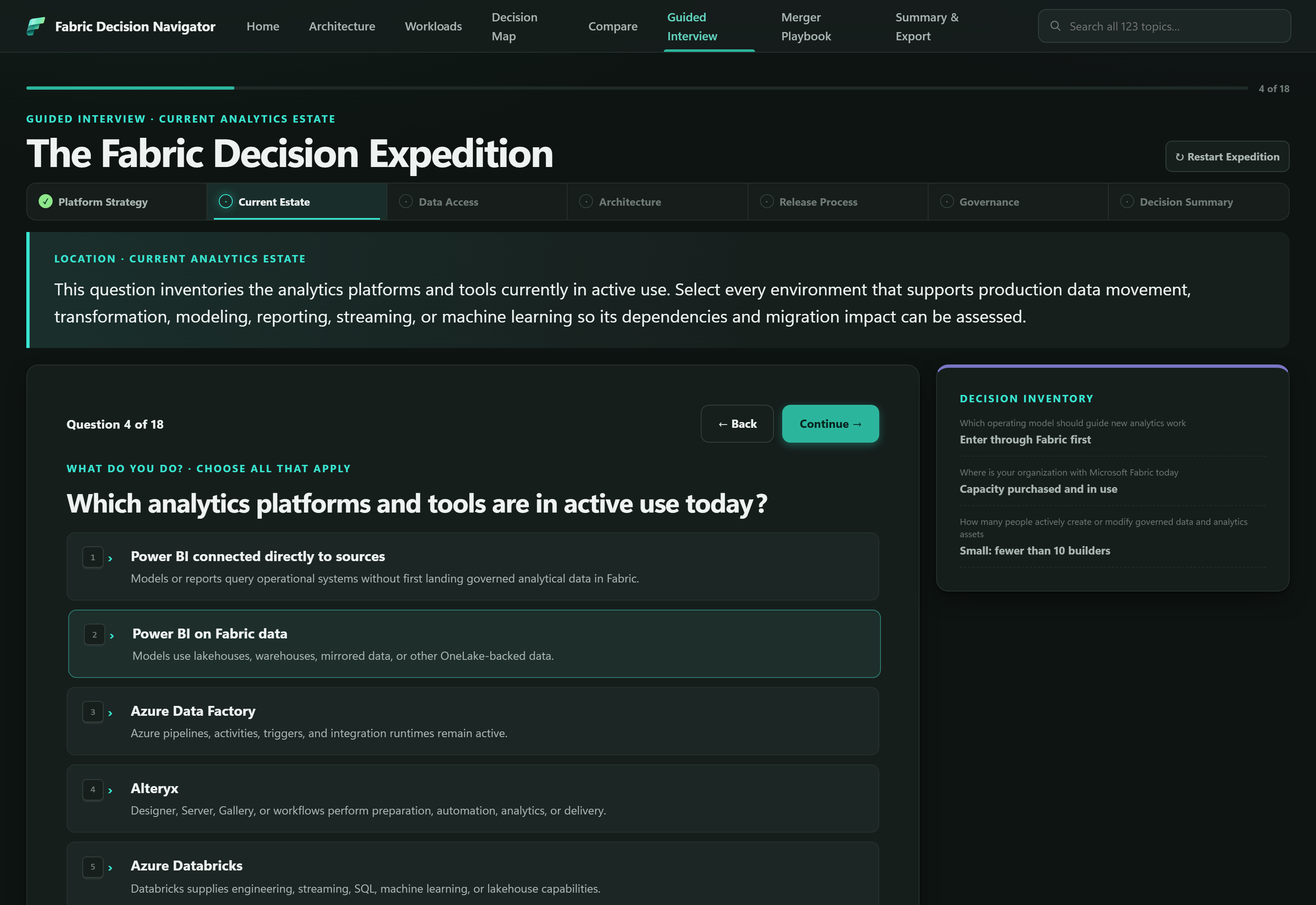
The Guided Interview tab showing question 4 of 18, with a progress bar, seven location tabs across the top, a location context panel, a numbered list of answer choices each with an explanation, and a Decision Inventory panel on the right.
Guided Interview - a single question, its choices, and the running decision inventory

Key Elements

  • Seven expedition locations progress rail Platform Strategy, Current Estate, Data Access, Architecture, Release Process, Governance, and Decision Summary. Each location is a checkpoint rather than a page count, so a conditional branch never makes the reader feel lost.
  • Conditional platform and migration branches 23 questions The bank holds 23 questions; any one run asks only what the previous answers make relevant. A Power BI-direct estate and a Fabric-first estate reach different questions from the same first screen.
  • Choice definitions on every option accessible Each answer carries a plain explanation beneath it, so a reader who does not already know what a managed analytical replica means can still answer honestly instead of guessing at the vocabulary.
  • Status-labeled outcomes decision cards Results are separated into Decided by User, Needs Validation, and Navigator Recommendation. The distinction is the point: the tool never presents its own suggestion as something the organization has agreed to.

Why an Interview, Not a Checklist

  • A checklist asks everyone the same questions; most will not apply
  • Branching keeps the run short - a typical route is 17 answers and produces 8 outcome cards, because related answers combine
  • Unresolved items are surfaced deliberately when an answer leaves a decision open, such as Not Sure or Not Yet Defined
  • Answers persist across refresh and travel in a shareable link

Merger Playbook

Sequenced scenario 7 decisions

One worked scenario that applies the research: two analytics groups, one operating model, seven decisions that have to be made in order. It is the concrete problem the learning was for, and a template for any decision sequence where order matters.

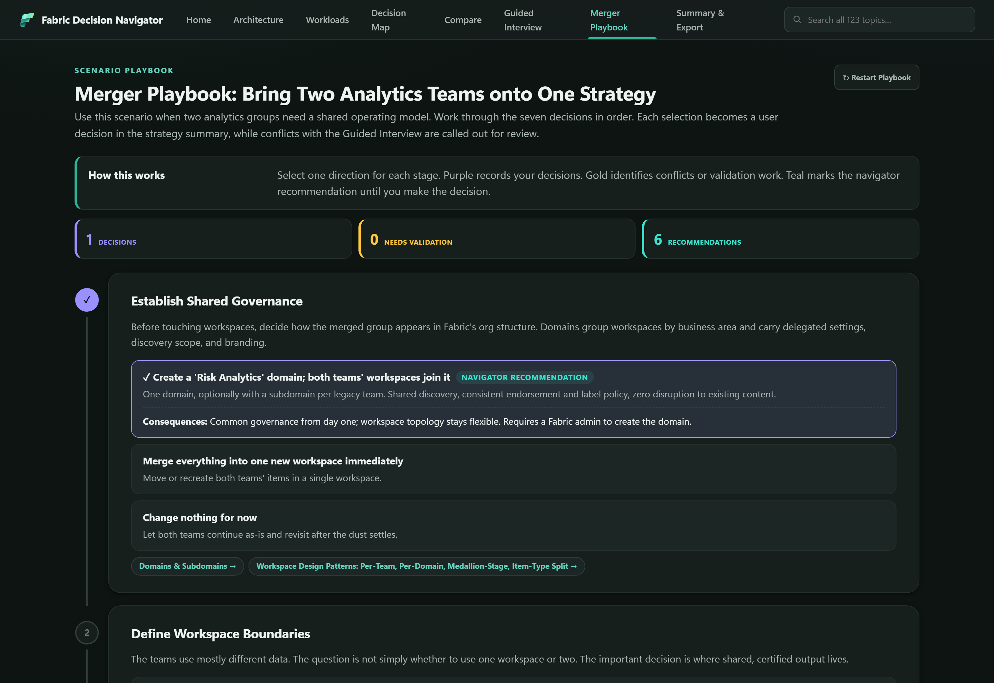
The Merger Playbook tab showing a How This Works explainer, three counters for Decisions, Needs Validation and Recommendations, and the first numbered stage, Establish Shared Governance, with three selectable directions - one carrying a Navigator Recommendation badge - and links to related topic cards.
Merger Playbook - stage one, with the navigator's recommendation marked as a recommendation

Key Elements

  • Seven sequenced stages ordered Beginning with Establish Shared Governance and Define Workspace Boundaries. The order matters: domain structure is settled before workspaces are cut, because reversing that sequence is what produces the silos the merger is meant to remove.
  • Three directions per stage including "do nothing" Each stage offers a recommended route, an aggressive route, and an explicit Change nothing for now. Naming the status quo as a choice makes deferral a recorded decision rather than a silent one.
  • Color as a state machine purple · gold · teal Purple records a decision the user made, gold identifies a conflict or outstanding validation, and teal marks a navigator recommendation that still stands because nobody has decided yet.
  • Conflicts with the interview are surfaced cross-checked A playbook selection that contradicts a Guided Interview answer is flagged for validation instead of silently overwriting it - the two views are allowed to disagree, but not quietly.

Each Stage Links Back to the Map

  • Stage one routes to Domains & Subdomains and Workspace Design Patterns
  • The playbook argues sequence; the topic cards carry the detail
  • Unanswered stages keep their navigator recommendation, so a partial run still exports a coherent strategy

Summary & Export

Portable output 4 export routes

Where the session stops being a browsing exercise and becomes a document somebody else can review.

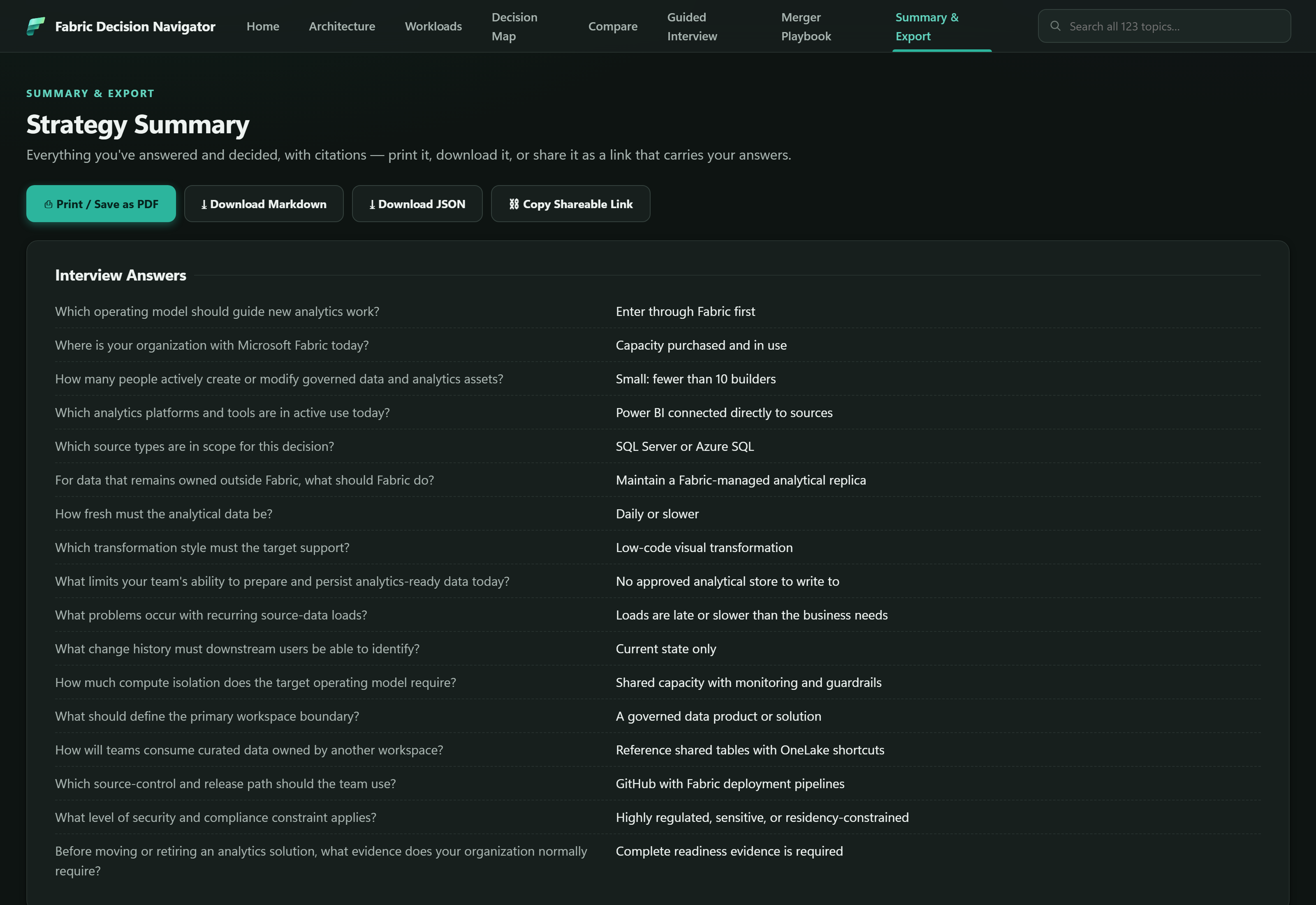
The Summary and Export tab showing four export buttons - Print or Save as PDF, Download Markdown, Download JSON and Copy Shareable Link - above an Interview Answers table pairing seventeen questions with the answers selected for each.
Summary & Export - every answer paired with its question, ready to export

Key Elements

  • Interview Answers question and answer Every answer is printed next to the question that produced it. An answer alone is not reviewable - a colleague reading the export needs to know what was asked.
  • Decision Outcomes status-separated Carrying the same Decided / Needs Validation / Recommendation distinction through to the exported document, so the status survives the handoff.
  • Markdown and JSON download Markdown for a document or a ticket; JSON for anything that wants to read the decisions programmatically.
  • Shareable link state in the URL Guided Interview answers and Merger Playbook decisions are carried in the link itself, so a colleague opens the filled-in session rather than an empty one - with no account, no server, and nothing stored anywhere central.

Print Is a First-Class Output

  • The strategy summary is designed to survive Print to PDF, not just to look right on screen
  • Citations travel with the decisions, so a reviewer can check a claim without reopening the tool
  • Versioned state migrates across schema changes, so an older saved link still resolves

Topic Cards, in Detail

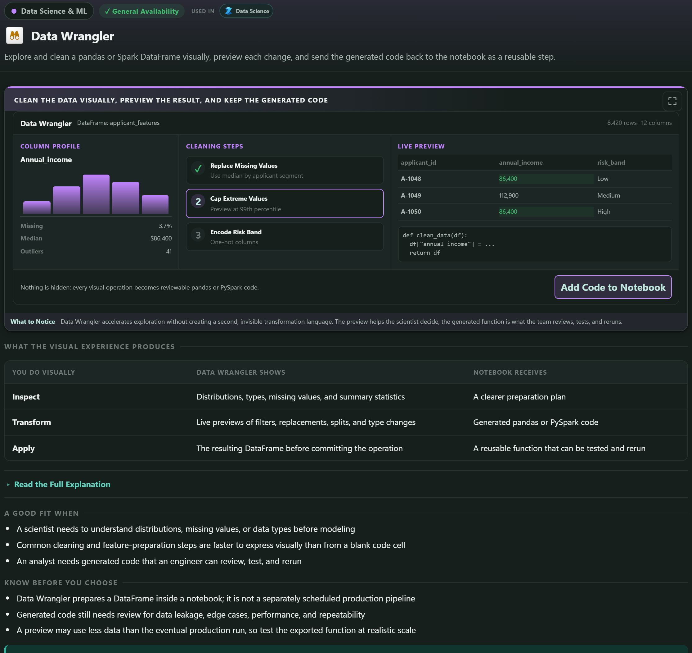
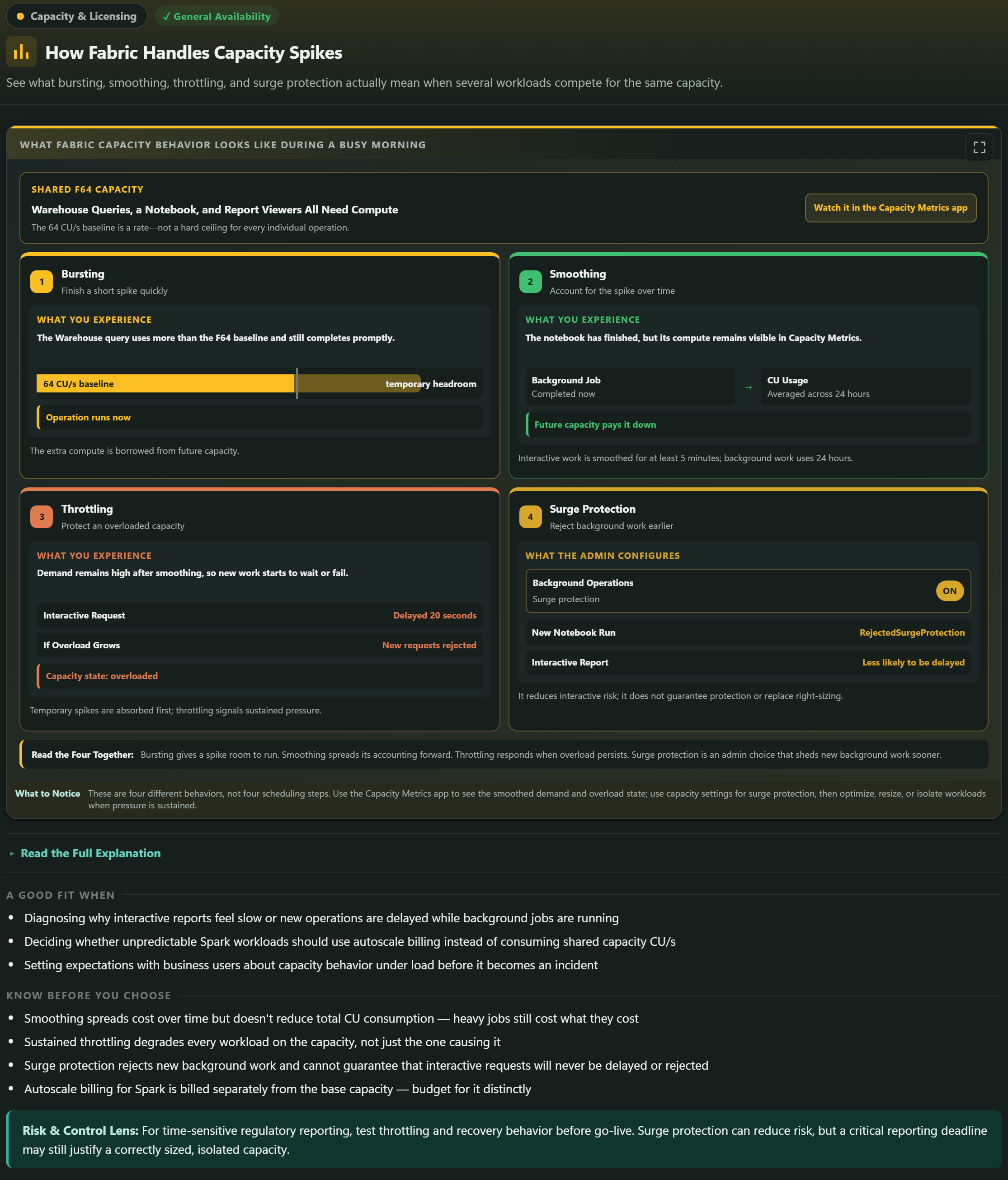
All 123 cards carry an implemented visual example. The strongest ones use named Fabric artifacts, show a visible configuration or review step, and end on a concrete resulting state rather than repeating a generic three-box panel. Pick any of these nine to see it in full.

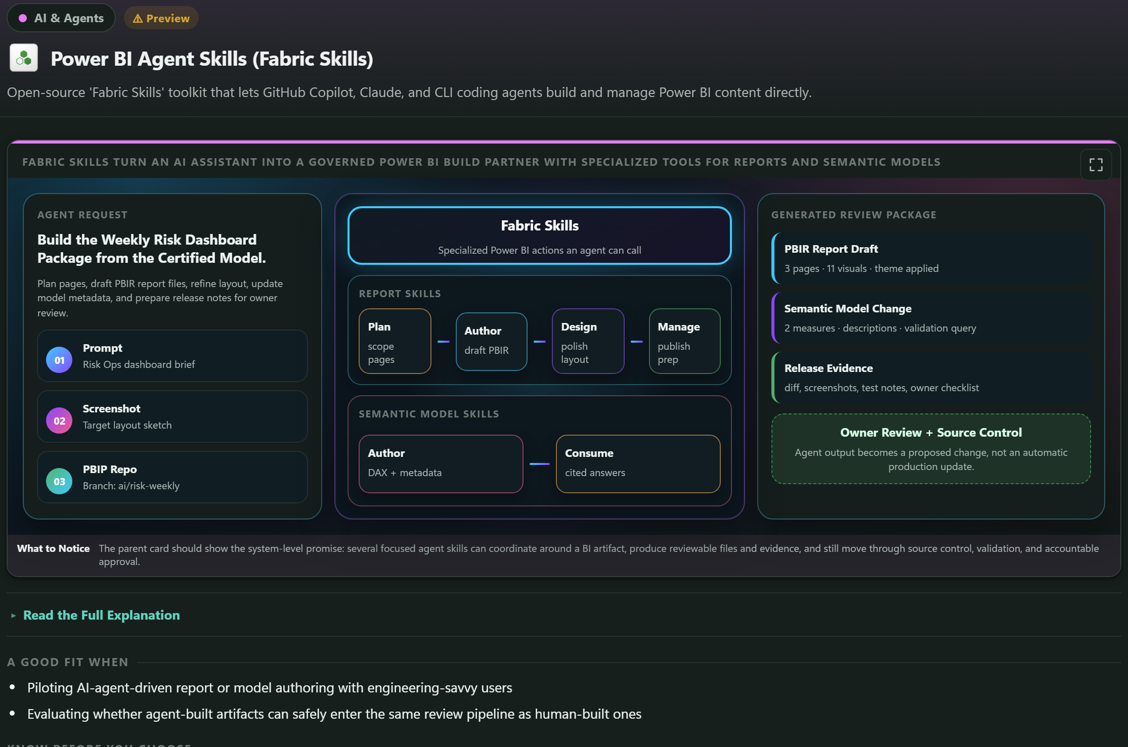
The Power BI Agent Skills topic card showing an agent request, a set of callable report and semantic model skills, and a generated review package containing a PBIR report draft, a semantic model change and release evidence, with a note that agent output becomes a proposed change rather than an automatic production update.
AI & Agents Power BI Agent Skills An agent that drafts a report and a model change, and produces a review package - with the governance boundary drawn in the card itself: the output is a proposed change, not a production update.

How It Was Built

Two deliverables, one source. A portable single file that opens from a USB stick or an email attachment, and a multi-page site with shared assets and canonical deep links - both generated by the same build, so neither can drift from the other.

STEP 01

Author in Source

Shell, styles, renderers and data live in src/; topic content and embedded product icons live in build/content/. The generated deliverable is never edited directly.

STEP 02

Validate the Contracts

Assembly checks topic IDs, page mounts, link targets and canonical URL examples. Stable IDs, URL fragments and persisted state keys are treated as contracts, not names.

STEP 03

Generate Both Editions

node build/assemble.js emits the standalone file and eight static pages with shared assets in dist/, from the same content in one pass.

STEP 04

Verify in a Browser

Contract, build-output and decision-system tests run first; visual and interaction changes are then checked in the running application at desktop and mobile widths.

Why Two Editions Instead of One

The portable edition exists because of where reference material actually gets read. A study guide is worth little if it needs a clone, a hosting environment, or an unlocked machine before it opens. A single HTML file with the CSS, JavaScript, content and icons inlined can be emailed or carried on a stick, and it opens.

The multi-page edition exists because that same content deserves real URLs - a link to one comparison or one topic card, sent into a discussion thread, that opens exactly where it should. Generating both from one source is what keeps the emailed copy and the linked copy telling the same story.

Neither build uses a CDN or makes a runtime network call. That is a requirement rather than a preference: an offline-capable deliverable cannot depend on a third-party host being reachable, or on it still serving the same file next year.

Where Each Kind of Change Lives

Markup and navigationShell, page structure, view mounts src/shell.html
Styling and card visualsResponsive behavior, topic-card scenes src/styles.css
Rendering and interactionViews, state, visual-card logic src/app.js
Interview and playbook dataQuestions, recommendations, comparisons src/data-core.js
Topic contentThe 123 topic cards build/content/
Portable deliverableGenerated - never edited by hand fabric-decision-navigator.html
Multi-page editionGenerated - eight pages, shared assets dist/

Icons Are Microsoft's, Not Redrawn

  • Product icons come from Microsoft's official Fabric icon set
  • Embedded at build time by build/embed-icons.js, so the standalone file needs no network
  • Microsoft permits their use in architecture diagrams, training material and documentation; all other rights reserved
  • This is an independent decision aid, not a Microsoft product

Design Decisions Worth Explaining

Four choices that shaped the navigator, each of which cost something and was made anyway.

Why It Ships Dark-Mode Only

The application originally carried a light-mode option. It was removed, and that is a real reduction in choice for anyone who prefers a light interface.

The reason is that the topic-card visual examples are not decorative panels - they are detailed scenes with Git status colors, diff highlighting, drought-style severity bands, leaderboards and lineage rails, each designed and validated against the dark palette. A theme toggle does not simply invert those; it requires every one of 123 cards to be re-validated in a second palette, and a card that renders perfectly while encoding the wrong emphasis is exactly the failure mode that no validator catches.

Shipping one palette that is genuinely verified was judged more honest than shipping two where only one had been checked. It is recorded as an intentional constraint rather than an omission, and the standard is explicit: the application stays dark-mode only unless that direction is deliberately changed.

Why the Decision Map and the Workloads Tab Use Different Taxonomies

These two tabs answer genuinely different questions, and collapsing them into one navigation tree would damage both.

The Workloads tab answers "which Fabric experience brings these capabilities together for a role or job?" and follows Microsoft's own workload taxonomy - because when a reader has been told to go and look at Data Factory, the tool should use that name and that grouping.

The Decision Map answers "what architecture, delivery or governance decision is being made?" and is organized into twelve decision domains with their own color family. A decision like how should data reach its destination spans Data Factory, Databases and Real-Time Intelligence; forcing it under one workload heading would hide the alternatives that make it a decision at all.

The rule that keeps the two from duplicating each other: a capability may legitimately relate to several workloads, and that relationship is modeled explicitly with a small marker rather than by creating a second copy of the topic record. One topic card, many routes to it.

Why Visual Examples Use Named Fabric Artifacts

The easy version of a topic-card visual is three boxes and an arrow. It is fast to build, it is consistent across 123 cards, and it teaches almost nothing - because the same three boxes describe every capability equally well, which is another way of saying they describe none of them.

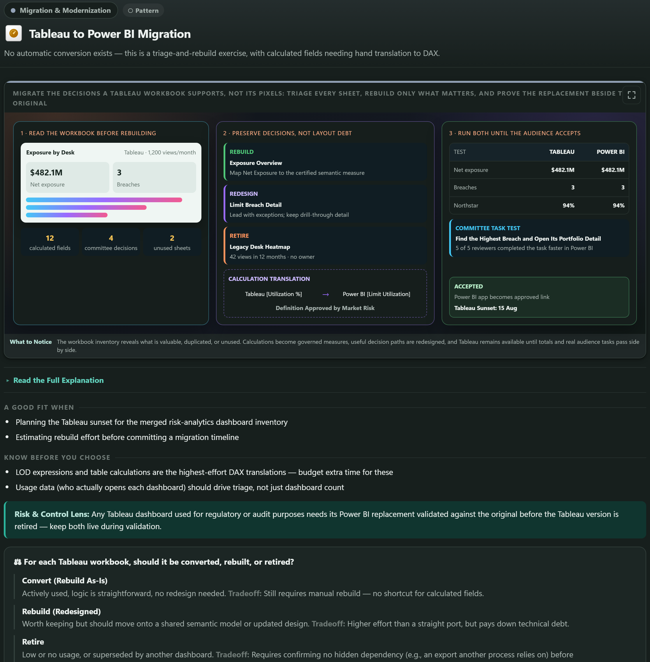
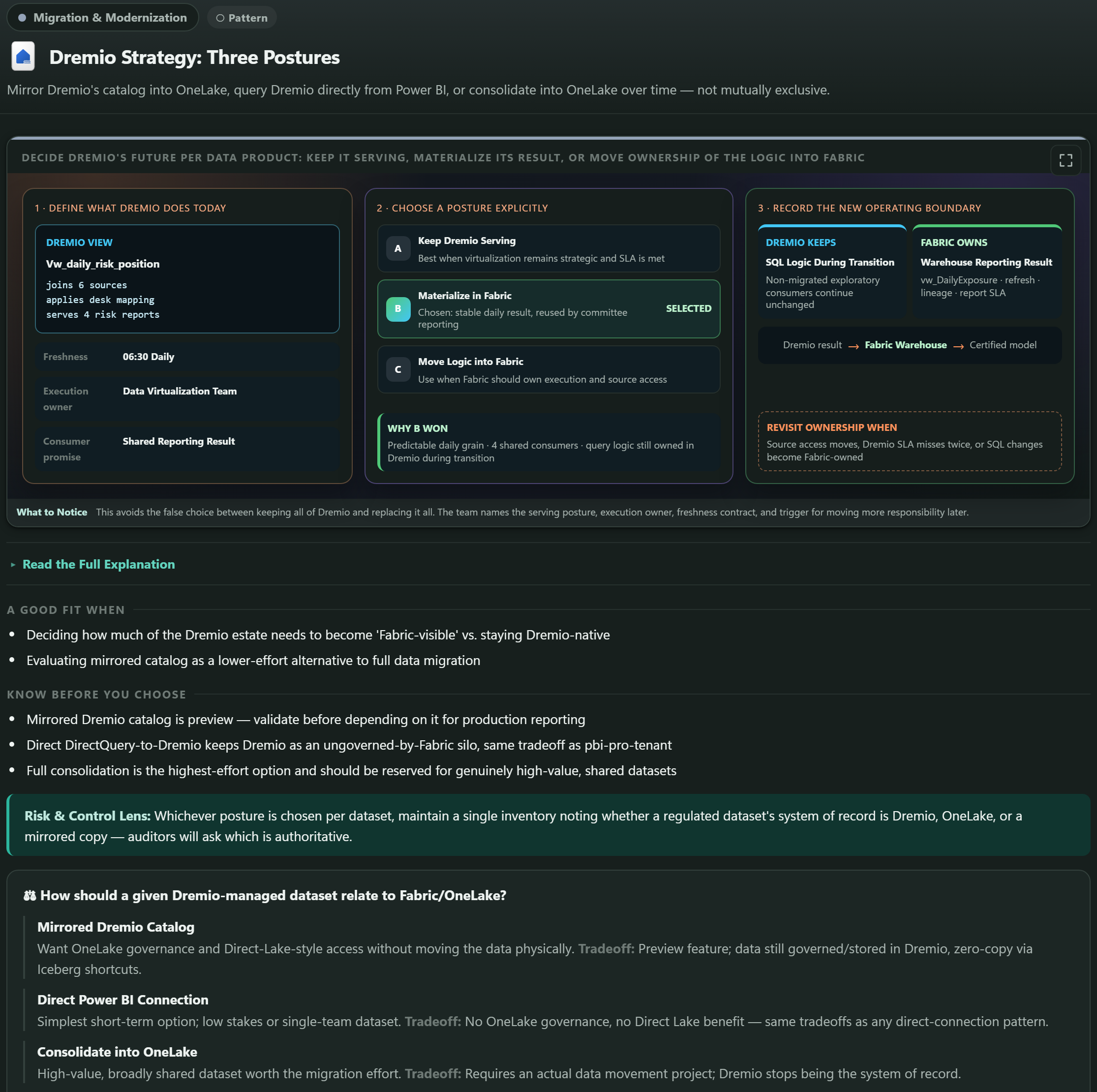
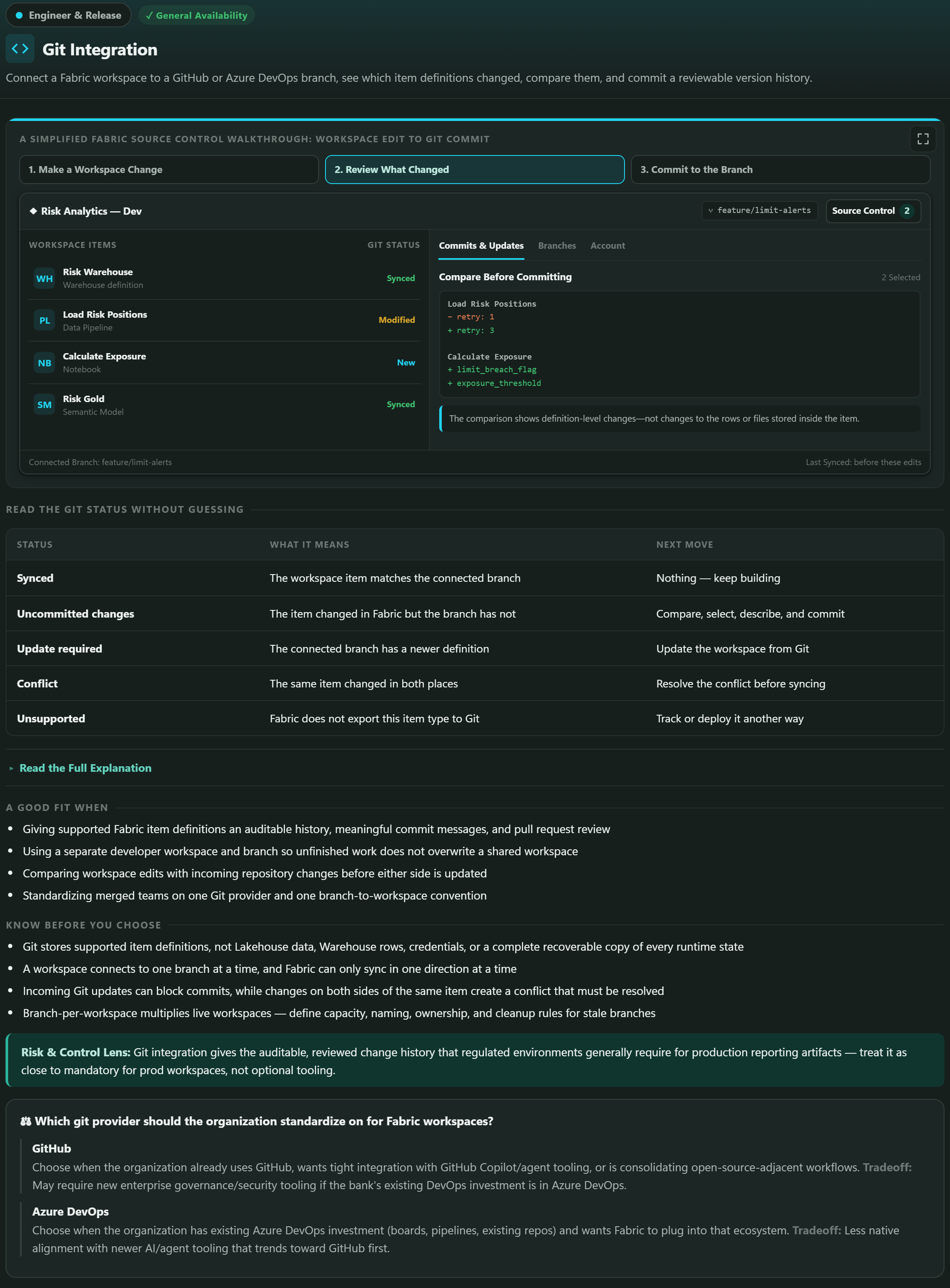
The standard applied here is that every card visual must explain that topic's particular idea. In practice that means named artifacts rather than placeholders: a Risk Warehouse, a Load Risk Positions pipeline, a vw_DailyExposure view, a feature/limit-alerts branch. Concrete names let a reader map the example onto their own estate; Table A and System B do not.

Each example also carries a visible configuration or review step and ends on a concrete resulting state - 18,421 accepted on both sides, 37 exceptions matched - rather than a vague assertion that the migration succeeded. Administrative topics keep simpler control paths where that genuinely fits, but every example carries its category color and a topic-specific decision.

Why Agentic BI Is Framed as Governed Acceleration

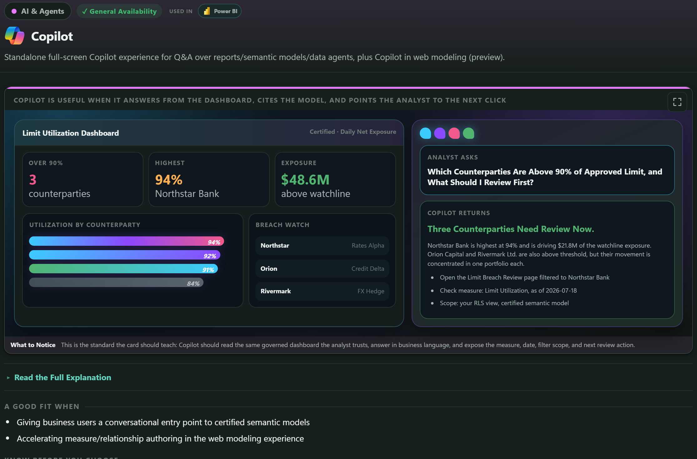
The AI and Fabric IQ cards - Copilot, Data Agents, Agent Skills, ontology, graph and planning - could have been written as automation stories. They deliberately are not.

The framing throughout is governed acceleration with human review: an agent drafts a report, proposes a semantic model change, and assembles a review package containing the diff, screenshots, test notes and an owner checklist. The card then states the boundary in its own words - agent output becomes a proposed change, not an automatic production update.

For a risk-analytics organization this is not a stylistic preference. The consumers of this content are numbers that go to a risk committee, and an accountable owner has to be able to say who approved a change to how exposure is calculated. An agent that shortens the drafting work is valuable; an agent that quietly edits a certified model removes the audit trail that makes the number usable.

So the acceleration is real and the gate is explicit, and the cards show the review package rather than implying that the review happens somewhere off-screen.