Project Overview

Use Power BI Report Skills and
Claude Code, to create a complete Dashboard.

The Power BI authoring skills (planning, semantic modeling, design, and PBIR report authoring) used to build a Charlotte weather dashboard including a real semantic model, DAX measures, 6 pages, and 25 visualizations, built entirely through Claude Code rather than dragging filters, visuals, and fields onto a canvas.

Origin story

A challenge I gave to Claude Code and Codex to see which would build the better one-shot weather-related dashboard, sourcing data from NOAA and using React, Tailwind, Recharts, Plotly, and D3. The Claude version became the design brief for this Power BI rebuild, and it is the build referred to throughout this page. Since a finished Power BI report can't be embedded in a web page, this is the full walkthrough.
31,545Daily records
1940–2026Years covered
3Model tables
37DAX measures
6Report pages
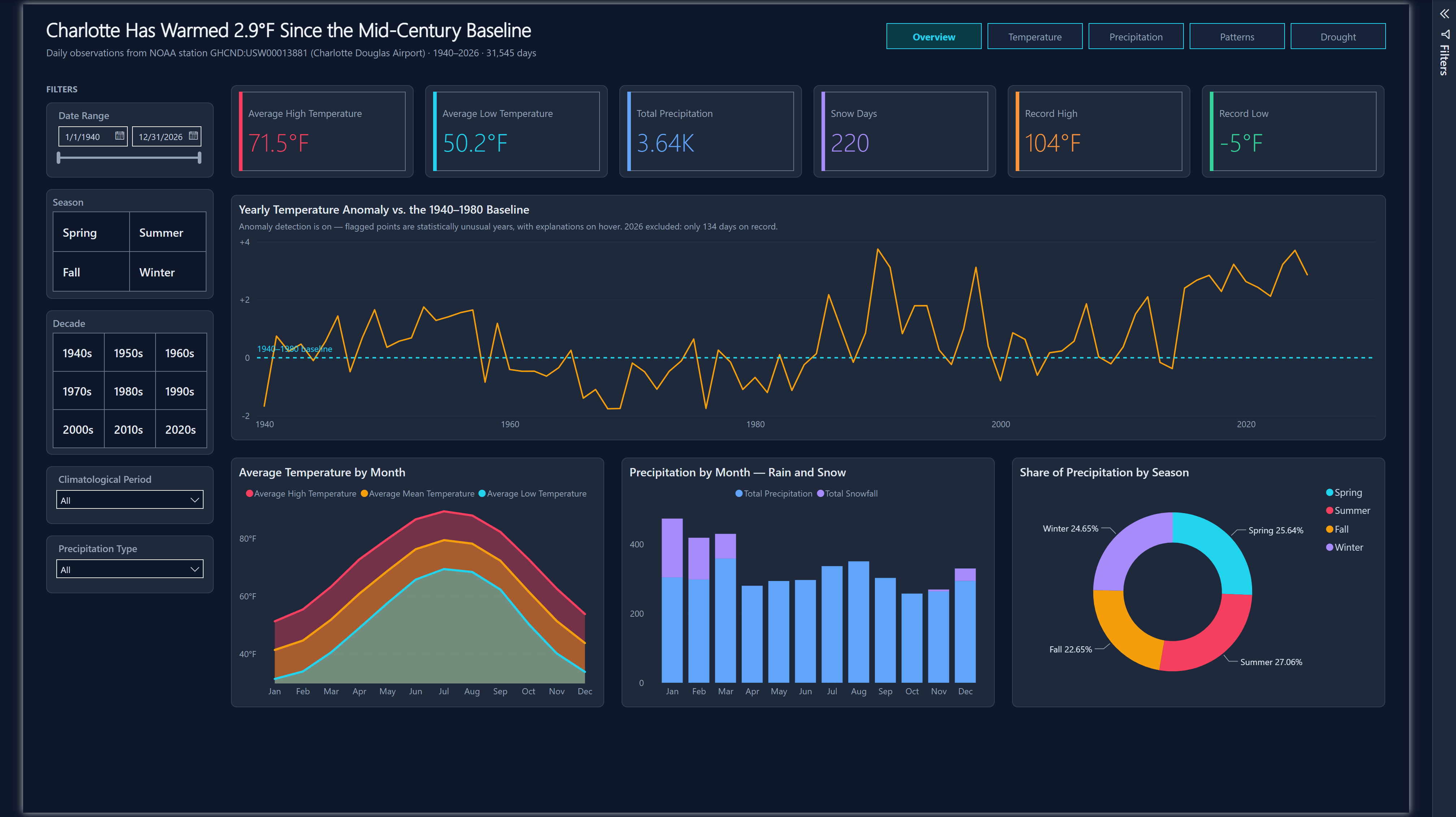
The Charlotte Weather Power BI report Overview page: six KPI cards, a yearly temperature anomaly line chart, a monthly temperature area chart, a precipitation column chart and a seasonal donut chart on a dark instrument-panel theme.

How It Was Built

The original JavaScript dashboards were built in a single shot. The Power BI version deliberately was not - report visuals bind to a semantic model, so if the model is wrong, every visual gets rebuilt. The work was sequenced to match that dependency, and each stage used a different authoring skill.

STEP 01

Plan the Translation

A spec first, not a literal port: which of original filters survive, what visuals need to be replaced, and what does Power BI simply do better.

STEP 02

Model Before Visuals

A flat JSON file became a star schema - a real marked Date table, a daily fact table, and the derived values the JavaScript computed at render time rewritten as DAX.

STEP 03

Design the System

A dark theme carried over from the original palette so both builds read as one system, with color assigned by meaning rather than by chart.

STEP 04

Generate the Report

Pages written as PBIR JSON by a deterministic Node generator, validated by CLI, then verified against real screenshots from Power BI Desktop.

Use the Originals as Reference

The original javascript dashboards were taken as the reference design to see how much Claude Code could replicate using the Power BI Report Skills authored by Microsoft.

Everything Stayed Local

  • No publish to the service, no workspace items, no tenant connection
  • PBIP, PBIR and TMDL text files that diff in git like source code
  • The whole report rebuilds from one command

The Semantic Model

This is where the project had to succeed first. The source data was a flat array of daily records with no date dimension - fine for JavaScript, which can just loop over it. Power BI needs structure.

From Flat File to Star Schema

  • Date dimension · 31,777 rows A contiguous daily calendar from 1940 to 2026, marked as the model's official date table. Carries Year, Month, Quarter, Decade, Season, Day Name and Type, and Climatological Period - every attribute the sidebar used to filter on, modeled once instead of derived per chart.
  • Observation fact · 31,545 rows One row per calendar day, joined many-to-one to Date. Holds the raw NOAA readings plus banding columns for precipitation type, intensity and temperature.
  • Rolling Window calculated · 989 rows One row per 12-month window with complete daily coverage - precomputed at refresh so the drought ranking is a lookup instead of a query-time scan.

Moved From JavaScript to DAX

  • 1991–2020 normals - the climatological baseline
  • Precipitation deficit and % of normal
  • Dry-streak length - consecutive-day runs
  • Rolling 12-month precipitation totals
  • 1940–1980 anomaly baseline
  • Drought classification into NOAA's D0–D4 bands

Validated, Not Eyeballed

  • Normal annual precipitation - 43.57"
  • Trailing 12-month actual - 28.71"
  • Deficit - 14.86" · 66% of normal
  • Longest dry streaks - 20 / 23 / 19 days
The Dry-Streak Measure, and the Bug That Made It Lie

DAX has no ordered-window primitive, so consecutive-run logic uses the date-minus-rank technique: for any unbroken run of days, date minus dense rank is constant, which turns "find consecutive runs" into "group by that constant".

VAR _DryDays =
    FILTER(
        CALCULATETABLE(
            SUMMARIZE('Observation', [Date], [Precipitation])
        ),
        NOT ISBLANK([Precipitation]) && [Precipitation] < 0.01
    )
VAR _Ranked =
    ADDCOLUMNS(_DryDays,
        "@Grp", INT([Date]) - RANKX(_DryDays, INT([Date]), , ASC, DENSE))
VAR _Streaks = GROUPBY(_Ranked, [@Grp], "@Len", COUNTX(CURRENTGROUP(), 1))
RETURN MAXX(_Streaks, [@Len])

The grouping worked on the first attempt. The semantics did not. In DAX, BLANK() < 0.01 evaluates to TRUE - so the 1942–43 gap, where NOAA recorded no precipitation at all, was counted as a 365-day drought. The NOT ISBLANK guard is the fix.

This is the failure mode worth internalizing: it produced a chart that rendered perfectly and was completely wrong. No validator catches that.

Why Blanks Were Preserved Instead of Zero-Filled

Profiling the source before modeling turned up two things that changed the design:

1942–43 have no readings at all for high, low, precipitation or snow - 730 rows. The original JavaScript coalesces prcp || 0, which silently plots those two years as near-zero precipitation - indistinguishable from a historic drought. The model keeps blanks blank, so lines break instead of diving to zero.

The mean-temperature fallback is not redundant. NOAA's reported daily mean covers only 10.5% of rows, in two disjoint bands: 1942–43 and 1998–2005. The documented fallback of (high + low) / 2 cannot fill 1942–43, because those are exactly the years missing high and low. The two sources are complementary, so mean temperature is a computed column coalescing both - the only form that recovers all three cases.

A 3,400× Speedup From Moving Work to Refresh Time

Ranking the current 12-month window against every other window on record started as a query-time iteration over ~1,030 overlapping windows: 41.6 seconds, and wrong. Windows overlapping the 1942–43 gap and the empty 2026 tail ranked as "driest" when they were merely unmeasured.

Requiring complete daily coverage fixed the correctness bug. Moving the computation into a calculated table evaluated at refresh took it to 12 milliseconds.

The corrected answer: the current window ranks 22nd driest of 989 - drier than 98% of the record. The first, broken version reported rank 1.

Authored by Code, Not on Canvas

Modern Power BI projects can be saved as PBIP - a folder of plain-text JSON and TMDL that lives in git and diffs like source. That makes the whole report programmable.

A Deterministic Page Generator

All six pages are emitted by a single Node script - 127 visual containers in total, once the shapes, textboxes and navigation buttons that make up the page furniture are counted alongside the charts. Every page, visual, binding and formatting rule is defined once in code and written out as PBIR JSON.

Page and visual IDs are SHA-derived from stable seeds, so re-running the generator produces an empty diff unless the design actually changed. That property is what makes a companion drift check meaningful: any difference is a real edit, never churn.

The payoff is consistency that would be tedious by hand - a 232px slicer rail, 8px grid snapping, and an identical title band on every page, all guaranteed by construction rather than by careful clicking.

Easy to Document

Because the whole report is plain text on disk, it can be read back and documented without anyone writing a spec by hand. Running the finished PBIP through NeonScribe - my custom documentation generator for BI reports - produces a complete technical reference: every page's layout, every filter, every visual and its field bindings, plus the underlying data model.

It is the same argument as the page generator, pointed the other way. The page generator turns a design contract into PBIR; the documentation turns PBIR back into a readable account of what was built - so the docs can never drift from the report they describe.

View the Generated Documentation

The Power BI Skills Used

Report planningRequirements, spec, translation judgments powerbi-report-planning
Semantic model authoringTables, relationships and DAX as TMDL semantic-model-authoring
Report designTheme, palette and layout contract powerbi-report-design
Report authoringPBIR page and visual mechanics powerbi-report-authoring
ValidationSchema, bindings, enums, layout bounds powerbi-report-author
Desktop bridgeReload and screenshot for visual verification powerbi-desktop

Read the Microsoft Learn documentation →

What the Reference Covers

  • Dashboard layout - the object grid for each of the six pages
  • Filters - every slicer and visual-level filter, with its field
  • Visuals - type, title, and the measures and columns each one binds
  • Data model - tables, relationships, columns and all 37 DAX measures
Why Validation Alone Wasn't Enough

The PBIR validator passed clean while the report still had ten real defects. Every one was caught by looking at rendered screenshots, and none was detectable statically. The most instructive:

DefectWhy it slipped through
Actual vs. normal at incomparable scales "Actual" summed all 86 Januaries (304") against a single-month normal (3.48"), so the normal bars were invisible slivers. The chart rendered perfectly and compared two quantities that were never comparable.
Tile slicer captions rendered blank Styling the label with an id selector validates cleanly and silently blanks the text.
Navigation strip rendered empty The built-in page navigator validated clean through four attempts and displayed nothing. Replaced with explicit buttons carrying page-navigation links.
2026 plotted as a dramatic cliff 134 days of a partial year on a per-year axis. Fixed with a visual-level filter to complete years only.
Tables showed meaningless totals Table visuals sum every numeric column by default - including ranks, temperatures and percentages.

Three separate defects shared one root cause: a formatting object that validates cleanly and silently renders nothing. Screenshot verification is the only thing that catches that class of bug.

The Report, Page by Page

Six pages - five in the navigation, plus a hidden drill-through target. Every screenshot is the live report rendered in Power BI Desktop with all 31,545 rows loaded.

Overview

Executive summary 5 visualizations

The landing page, built to land one argument in the title itself: Charlotte has warmed 2.9°F since the mid-century baseline.

Power BI Overview page showing six KPI cards, a yearly temperature anomaly line chart, a monthly temperature area chart, a monthly precipitation column chart, and a seasonal donut chart on a dark theme with a filter rail on the left.
Overview - KPI strip, anomaly trend, and seasonal structure

Visualizations

  • Six KPI cards cardVisual Average high and low, total precipitation, snow days, and record high/low. Each carries a colored left accent bar assigned by meaning - rose for heat, cyan for cold, blue for water, violet for snow - so the strip is readable at a glance rather than being six identical tiles.
  • Yearly Temperature Anomaly lineChart Each year's mean plotted as a departure from the fixed 1940–1980 baseline, with a reference line at zero. Native anomaly detection is enabled, so statistically unusual years are flagged automatically with explanations on hover - something the JavaScript build has no equivalent for.
  • Average Temperature by Month areaChart High, mean and low across the calendar year, layered to show the seasonal envelope and how wide the daily range runs in each month.
  • Precipitation by Month columnChart Rain and snow stacked per month, so the winter snow contribution reads as a distinct violet band on top of the rainfall total.
  • Share of Precipitation by Season donutChart The direct successor to the original's hand-rolled D3 donut. Summer leads at 27.06%, and the four seasons sit within about 2.5 points of each other - Charlotte has no dry season.

Filters & Navigation

  • Date Range between-slicer, clamped to 1940–2026
  • Season and Decade tile grids, Climatological Period and Precipitation Type dropdowns
  • Five nav buttons top-right, active page highlighted in cyan
  • The slicer rail is synced across pages - a selection follows you
  • Clicking any donut segment or bar cross-filters every other visual

Temperature

Analytical canvas 4 visualizations

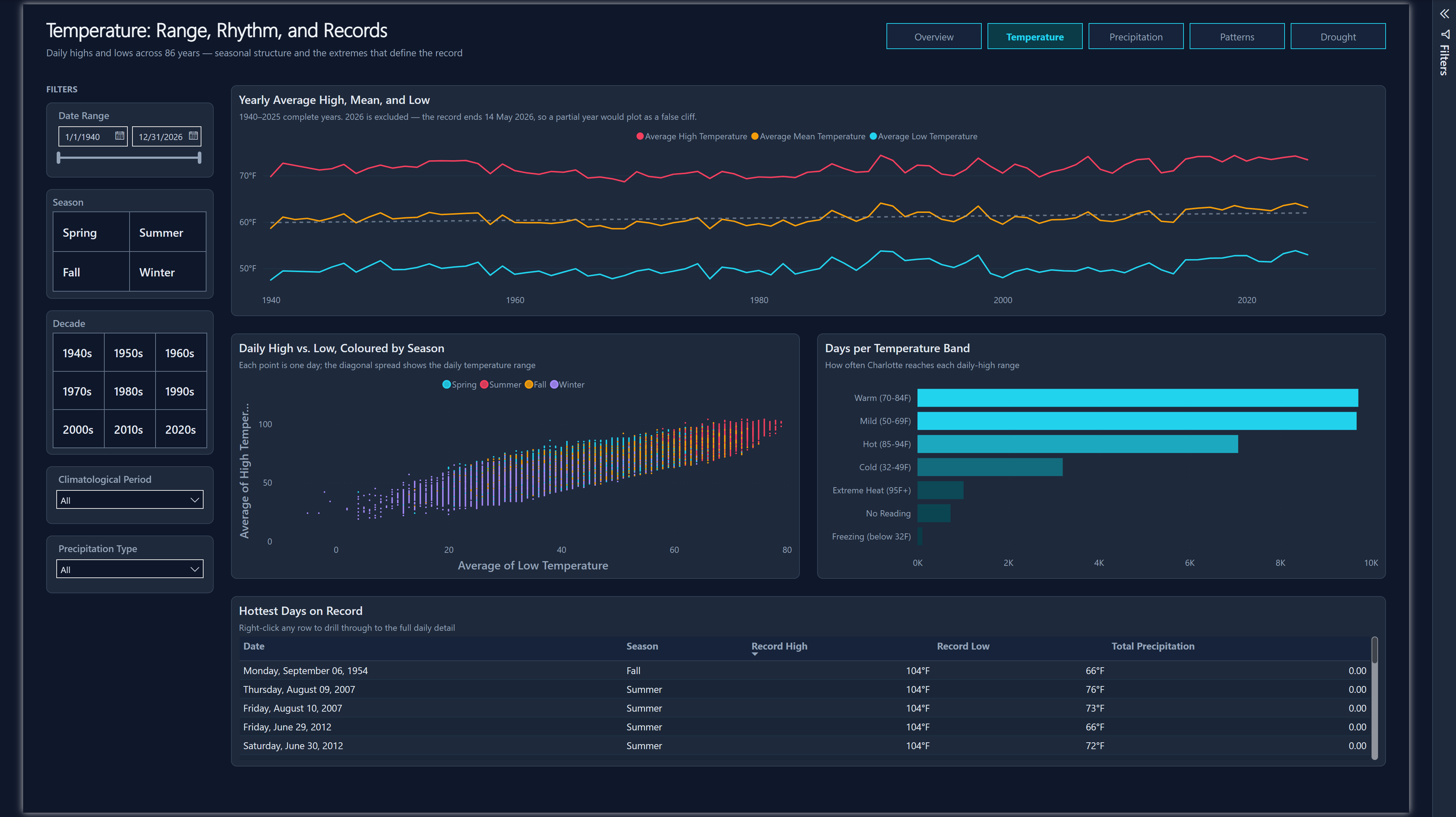
Range, rhythm and records - the seasonal structure of the record and the extremes that define it.

Power BI Temperature page showing a yearly high, mean and low line chart, a daily high versus low scatter plot colored by season, a horizontal bar chart of days per temperature band, and a table of the hottest days on record.
Temperature - yearly trend, daily distribution, and record extremes

Visualizations

  • Yearly Average High, Mean and Low lineChart Three series across 86 years with a dashed baseline reference. All three lines drift upward, and the low-temperature line rises most - overnight lows are warming faster than daytime highs. 2026 is filtered out; a 134-day partial year would plot as a false cliff.
  • Daily High vs. Low, Colored by Season scatterChart Every one of the 31,545 days as a single point, colored by season. The diagonal spread is the daily temperature range, and the four seasonal clusters separate cleanly along it without any need for a legend lookup.
  • Days per Temperature Band clusteredBarChart How often Charlotte reaches each daily-high range, from Freezing to Extreme Heat. Built on a banding column in the model, so the same six categories drive the machine-learning visual on the Precipitation page.
  • Hottest Days on Record tableEx The top of the record, ranked. Column totals are explicitly disabled - a "total" row summing record temperatures would be meaningless. Right-click any row to drill through to that day's full detail.

Filters & Design Notes

  • The same five synced slicers as Overview
  • Month, Day Type and Precipitation Band sit in the collapsible filter pane - available on demand at zero canvas cost
  • Color is assigned by meaning, not by chart: rose is always hot, cyan is always cold, and that mapping holds across every page
  • Visual-level filters are hidden from the consumer filter pane - they encode authoring decisions, not viewer choices

Precipitation

Machine learning 5 visualizations

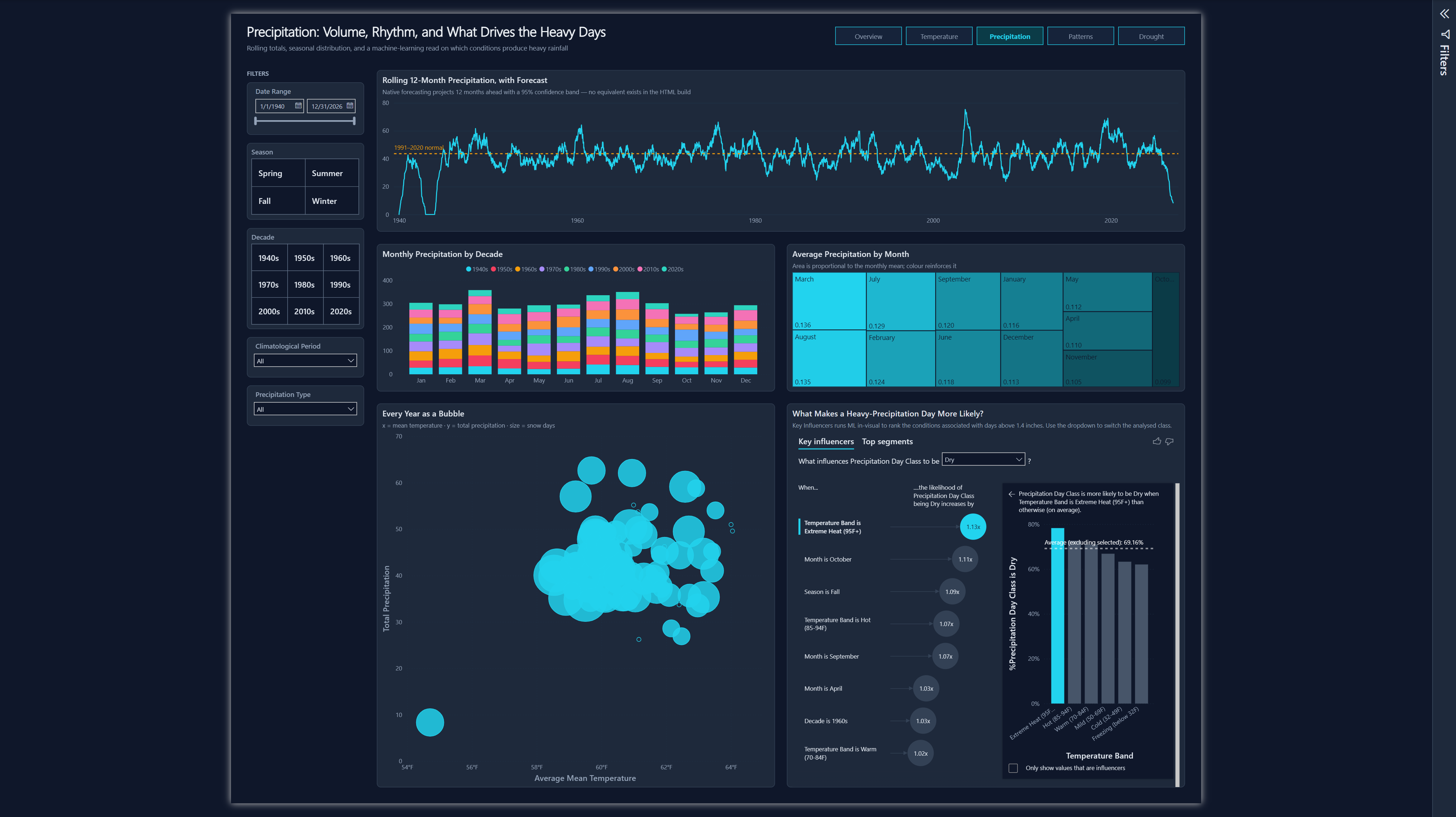
Volume, rhythm, and a machine-learning read on which conditions actually produce heavy rainfall.

Power BI Precipitation page showing a rolling 12-month precipitation line chart with forecast, a stacked column chart by decade, a treemap of average precipitation by month, a bubble chart of every year, and a Key Influencers machine learning visual.
Precipitation - rolling totals, seasonal distribution, and Key Influencers

Visualizations

  • Rolling 12-Month Precipitation lineChart Every 12-month total since 1940 against the 1991–2020 normal, drawn as a dashed amber reference. Native forecasting projects ahead with a 95% confidence band. The plunge at the right-hand edge is the current deficit - the argument the Drought page then makes in full.
  • Monthly Precipitation by Decade columnChart Each month broken into its nine decades, so both the seasonal shape and the decade-to-decade variation are visible in one chart.
  • Average Precipitation by Month treemap Successor to the original's Plotly treemap. Area is proportional to the monthly mean and a single-hue cyan gradient reinforces it - a categorical palette here would imply difference where the data only has magnitude.
  • Every Year as a Bubble scatterChart Three dimensions at once: mean temperature on x, total precipitation on y, and snow days as bubble size. The lone outlier at the bottom left is a partial year.
  • What Makes a Heavy-Precipitation Day More Likely? keyDriversVisual Key Influencers runs machine learning inside the visual, ranking the conditions associated with days above 1.4 inches - the 95th percentile of wet days. It reports that Extreme Heat raises the likelihood of a dry day by 1.13×, with October and Fall close behind. There is no JavaScript equivalent; this is the clearest case of Power BI doing something the original build simply cannot.

Filters & Design Notes

  • A dropdown inside Key Influencers switches the analyzed class between Heavy, Normal Wet and Dry
  • "No Reading" is filtered out of the ML visual - the 1942–43 gap is a real column value and would otherwise be offered as a category
  • This page has the tallest canvas in the report to give the ML visual and the bubble chart room to breathe
  • The heavy-day threshold of 1.4" is computed from the data, not chosen by hand

Patterns

Interactive decomposition 3 visualizations

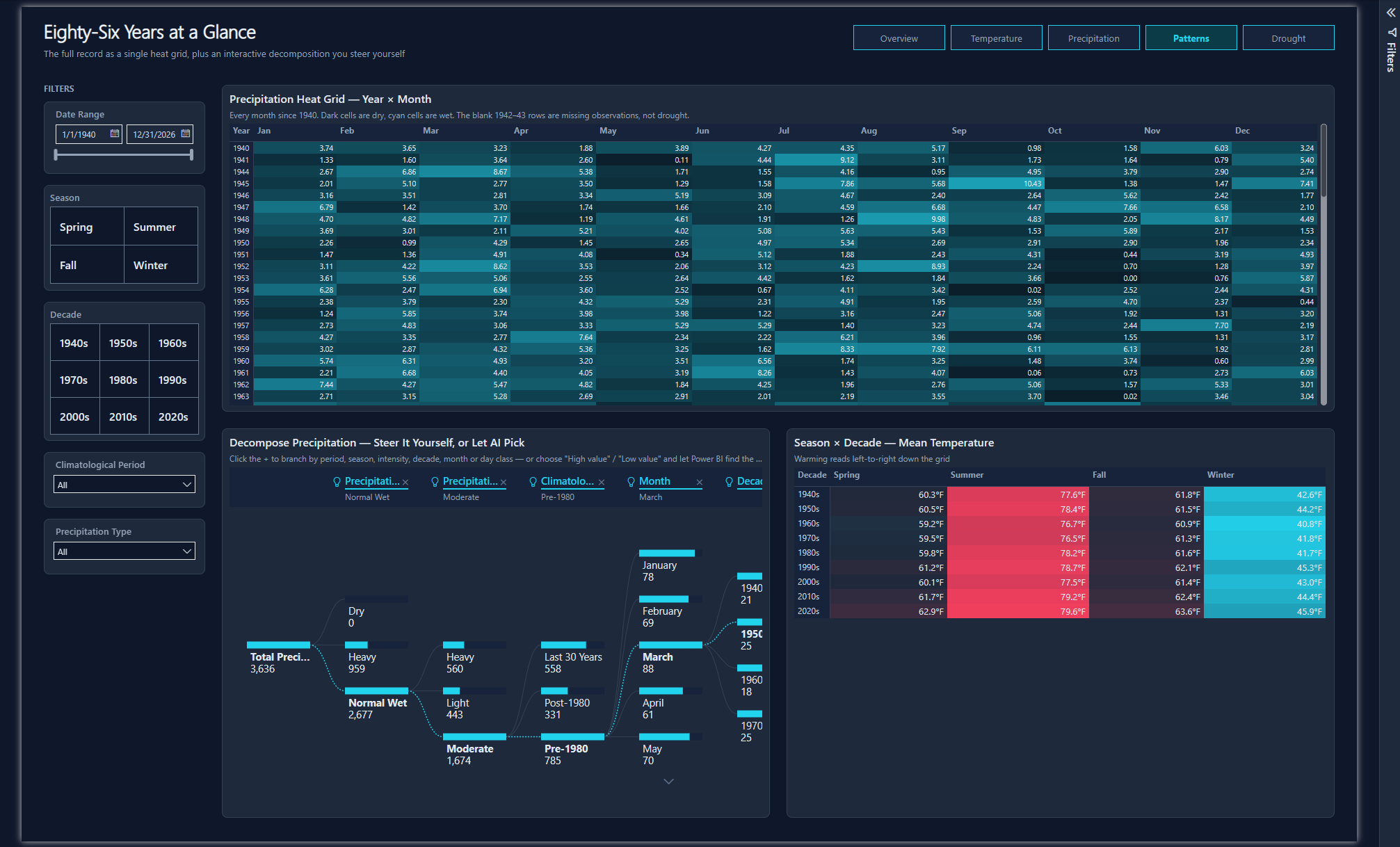
The full record as a single heat grid, plus a decomposition tree the reader steers themselves.

Power BI Patterns page showing a precipitation heat grid of year by month, a decomposition tree visual, and a season by decade matrix of mean temperature with red and cyan conditional formatting.
Patterns - 86 years as a heat grid, with AI-assisted decomposition

Visualizations

  • Precipitation Heat Grid pivotTable Every month since 1940 as one cell - the densest visual in the report, roughly 1,030 data points in a single view. Conditional background formatting runs dark for dry and cyan for wet. The blank 1942–43 rows are visible as genuine gaps, which is precisely the honesty the zero-filling original loses.
  • Decompose Precipitation decompositionTreeVisual An interactive breakdown the viewer drives: click any + to branch by period, season, intensity, decade, month or day class. AI splits are enabled, so choosing "High value" or "Low value" lets Power BI pick the most interesting branch itself. This is genuinely impossible in the static JavaScript build.
  • Season × Decade Mean Temperature pivotTable Nine decades against four seasons with diverging conditional formatting. Warming reads left-to-right down the grid: summer climbs from 77.6°F in the 1940s to 79.6°F in the 2020s, and winter from 42.6°F to 45.9°F - winters are warming faster than summers.

What Replaced the Map

  • The original's Trends tab had a Plotly map with a single station marker
  • One point on a map is decorative rather than analytical - it says "the data came from here", which a caption conveys equally well
  • It was replaced with the heat grid, trading a decorative visual for the densest one in the report

Drought

Narrative story 6 visualizations

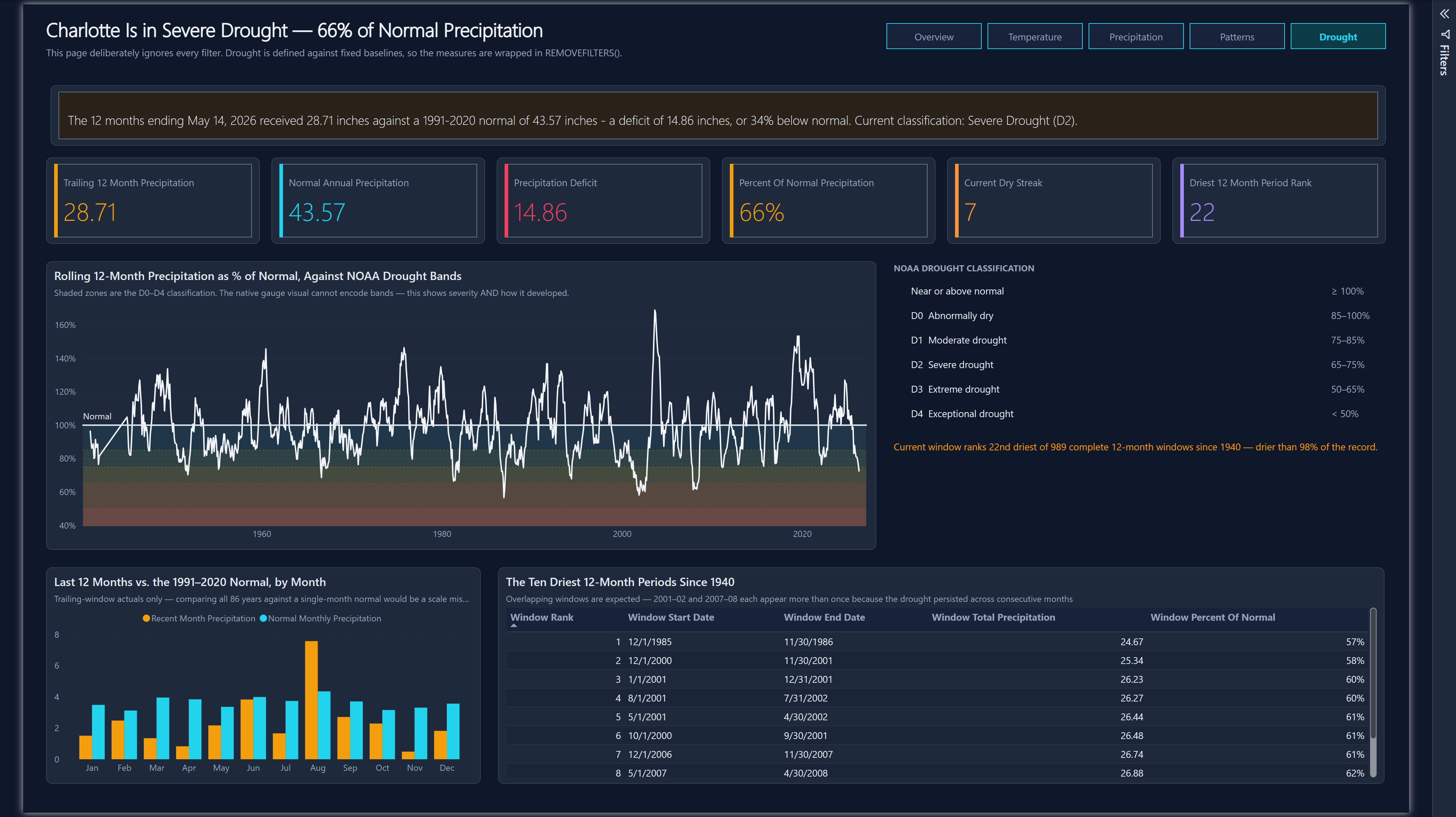
The page that makes the argument: Charlotte is in severe drought at 66% of normal precipitation.

Power BI Drought page showing an alert banner, six KPI cards, a rolling percent-of-normal line chart with shaded NOAA drought classification bands, a classification legend, an actual versus normal column chart, and a table of the ten driest 12-month periods.
Drought - banded severity trend with the full D0–D4 classification

Visualizations

  • Alert banner textbox + DAX Not static text - a DAX measure assembles the whole sentence from live values, so the inches, the deficit, the percentage and the classification all update together.
  • Six drought KPIs cardVisual Trailing 12-month actual, the normal, the deficit, percent of normal, the current dry streak, and where this window ranks historically. Amber for actual, cyan for normal, rose for deficit.
  • Rolling % of Normal vs. NOAA Bands lineChart The centerpiece, and the one visual that had to be reinvented. The original used a hand-drawn SVG gauge with D0–D4 severity bands; Power BI's native gauge has no concept of classification bands. The replacement encodes all five NOAA categories as independently colored shaded zones behind a rolling percent-of-normal series - which carries strictly more information than the gauge did: current severity, and how it developed, and how it compares to every past drought.
  • NOAA Drought Classification textbox grid The D0-D4 scale spelled out beside the chart, mapping each severity band to its percent-of-normal range. Power BI has no legend visual for a custom classification, so this is a hand-built grid of 16 aligned textboxes - the single largest piece of page furniture in the report, and the reason this page carries 39 objects for 5 charts. Below it, a DAX measure writes the live ranking sentence: the current window is 22nd driest of 989 complete 12-month windows since 1940, drier than 98% of the record.
  • Last 12 Months vs. Normal clusteredColumnChart Month-by-month actual against the 1991–2020 normal. Clustered rather than stacked, because stacking hides exactly the comparison being made.
  • The Ten Driest 12-Month Periods tableEx Historical context, ranked. Overlapping windows are expected and labeled as such - 2001–02 and 2007–08 each appear more than once because those droughts persisted across consecutive months.

This Page Has No Filters - by Design

  • Drought is defined against fixed baselines, so letting a viewer filter to the 1950s would produce a number that looks authoritative and means nothing
  • The page carries no slicers at all, and the measures are additionally wrapped in REMOVEFILTERS() - belt and braces
  • The subtitle states this outright rather than leaving it as a surprise

Daily Records

Hidden drill-through 2 visualizations

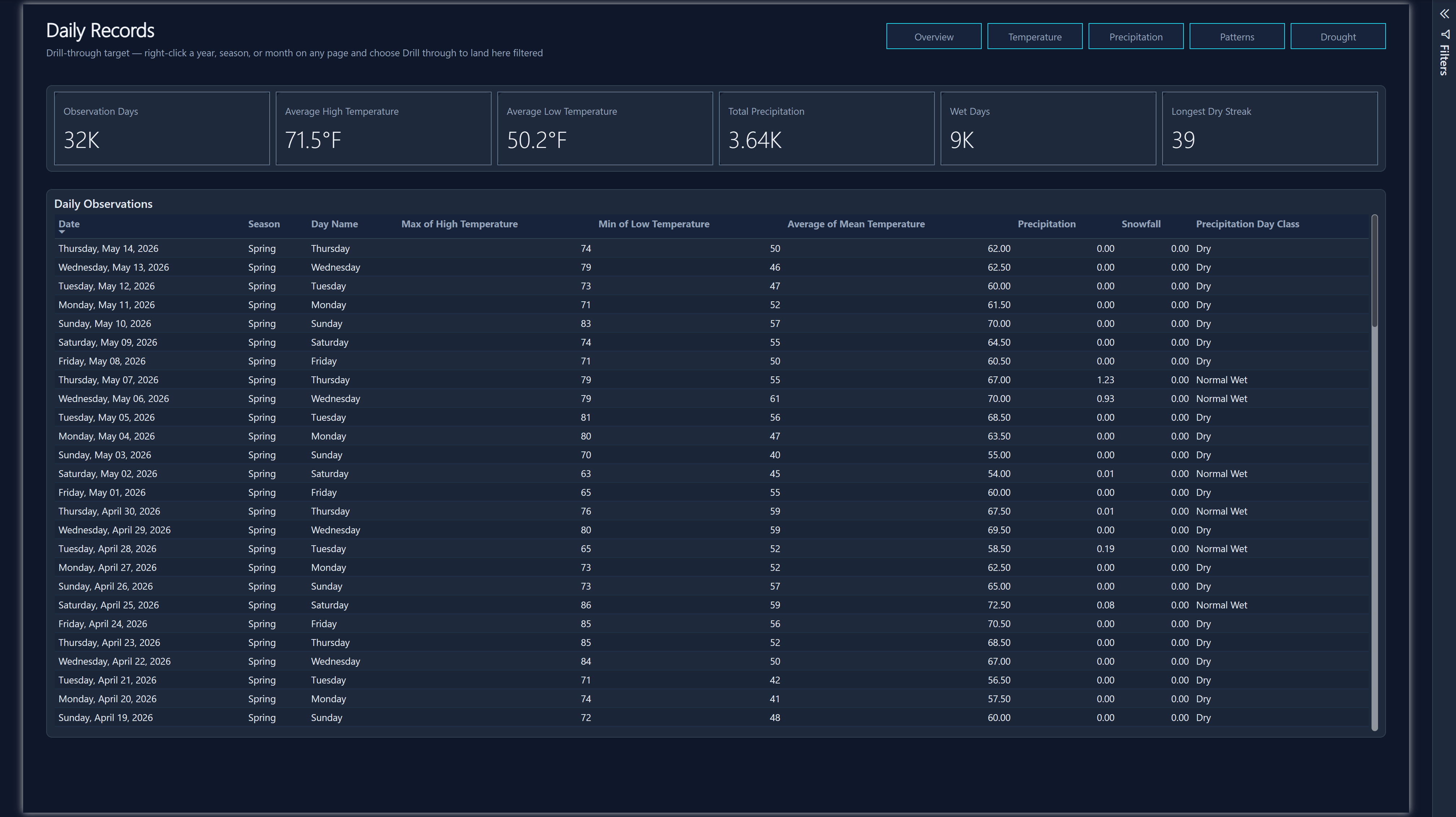
A sixth page that never appears in the navigation - you arrive here by right-clicking something else.

Power BI Daily Records drill-through page showing six KPI cards and a detailed table of daily observations with date, season, day name, temperatures, precipitation, snowfall and day class columns.
Daily Records - the drill-through target, filtered by whatever you came from

Visualizations

  • Six context KPIs cardVisual Observation days, average high and low, total precipitation, wet days and the longest dry streak - all recalculated for whatever slice you drilled from, so the summary always describes the rows below it.
  • Daily Observations tableEx The underlying grain, fully exposed: date, season, day name, high, low, mean, precipitation, snowfall and day class. This is the bottom of the model - the actual NOAA rows behind every aggregate in the report.

Why This Page Matters

Drill-through is the capability with no JavaScript counterpart in the original build. Every aggregate in the report is a summary of specific days, and this page makes those days reachable in two clicks from anywhere - without a single line of routing code, and without ever loading 31,545 rows into a browser.

How You Get Here

  • Right-click a year, season, month or bar on any page
  • Choose Drill through → Daily Records
  • The page opens filtered to exactly that selection, with a back button
  • Excluded from the nav strip on purpose - it is a destination, not a starting point. Landing on it unfiltered would mean scrolling 31,545 undifferentiated rows

Power BI vs. JavaScript

The same 31,545 records rendered - first in JavaScript dashboards built by Claude Code and Codex, then as this Power BI report - in tools with genuinely different strengths. Neither version is simply better.

Where Power BI Wins

  • Cross-filtering everywhere for free - the JavaScript build wires every filter interaction by hand
  • Drill-through to daily detail from any aggregate, with no routing code
  • Machine learning in-visual - Key Influencers, decomposition trees, anomaly detection and forecasting are all configuration, not implementation
  • Reusable measures - the normals are defined once; the JavaScript version recomputes them independently in its Drought tab
  • Consistent formatting at the field level rather than per chart

Where the JavaScript Build Wins

  • Cascading filters - months gray out when outside the selected seasons; Power BI slicers don't cascade that way
  • Pixel-exact layout - the KPI cards and alert banner are designed in a way Power BI's grid resists
  • The SVG gauge, with its D0–D4 bands drawn exactly as intended
  • Inline colored numbers in the alert banner - a DAX string measure can assemble the sentence but not color individual values within it
  • Zero-friction sharing - it opens in any browser, with no license